Introduction
When planning a project weather plays an important role, we want to plan for days where we will have reduced production or no production at all, build float into our schedules to avoid delays, coordinate the best time for given trades to perform their work, etc. To do this we need historical weather data, NOAA to the rescue, the following link will take you to the National Center for Environmental Information’s climate at a glance by city, using the time series page you can create a time series for a given city.
https://www.ncei.noaa.gov/access/monitoring/climate-at-a-glance/city
After selecting you data you can download a csv file that can be analyzed. Here we will look at the precipitation for San Diego, CA and will use data from the year range 2002 – 2022.
Setting up
To get started we need to install the libraries we will be using, since XlsxWriter is not a standard libary in Google Colab we will need to install it (!pip is for Colab, if using a local machine you dont need the “!” in font of pip). For this article we are using polars instead on pandas, but if you are familiar with pandas that would work just as well. We are using polars primarily to show that there is more than one library for creating and manipulating data frames. Write the following two cells of code.
!pip install XlsxWriter
from google.colab import files
import json
import matplotlib.pyplot as plt
import numpy as np
import polars as pl
import seaborn as sns
import xlsxwriter
Importing and Formatting Data
We need to bring our data into polars and create a data frame. To do this we simply need to use the polars read_csv() function, pass it the data path ‘/content/sd_precip.csv’ (since this is in colab, I uploaded the csv into the notebook and copied the path into this function). In the function you will notice a \ right after the data path, if you havent come across this yet now is a good time to explain, the \ in python is an escape character, it tells Python to move on to the next line but remain in the same block of code, this allows us to write a long function over multiple lines and not one long line, making the code more readable. We then skip the first 4 rows as they contain descriptive data about the time series, and we truncate ragged line (do to the format of the output from NOAA this is needed to get the data into a data frame).
precip = pl.read_csv('/content/sd_precip.csv', \
                     skip_rows=4, truncate_ragged_lines=True)
print(precip)
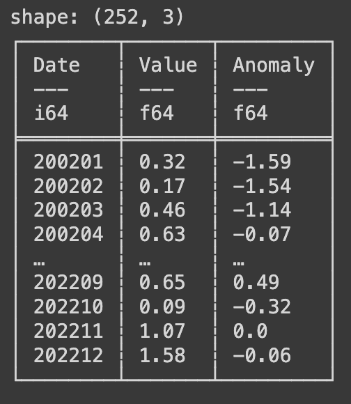
Upon executing this line we get a data frame with the shape of (252, 3) this means we have 252 rows and 3 columns. Polars prints data frames in a much more conventional looking table format if you are coming from Excel. The top section of the table explains the column names and the data type in each column (i64 is an integer, f64 is a float).
You may have noticed that the dates in the data set are in the format of year number plus month number such as 200201 for January 2002. There are a few ways to manipulate, for this article we are going to add a day and convert it to a YYYY-mm-dd format. Write the following code.
precip = precip.select(pl.col('Date').cast(pl.Utf8), pl.col('Value'),)
precip = precip.rename({'Value': 'value'})
print(precip)
In the code above we are selecting the two column we will be using, the date and value columns, while selecting the date column we used the .cast() method and converted the data type to a string (utf8). We also renamed the Value column to all lowercase. Next we will continue to transform our date column. Write the following code next.
precip = precip.with_columns(pl.col('Date').str.slice(4).alias('month'),)
precip = precip.with_columns(pl.col('Date').str.replace(r"..$", "").alias('year'),)
precip = precip.with_columns(pl.lit("01").alias('day'))
print(precip)
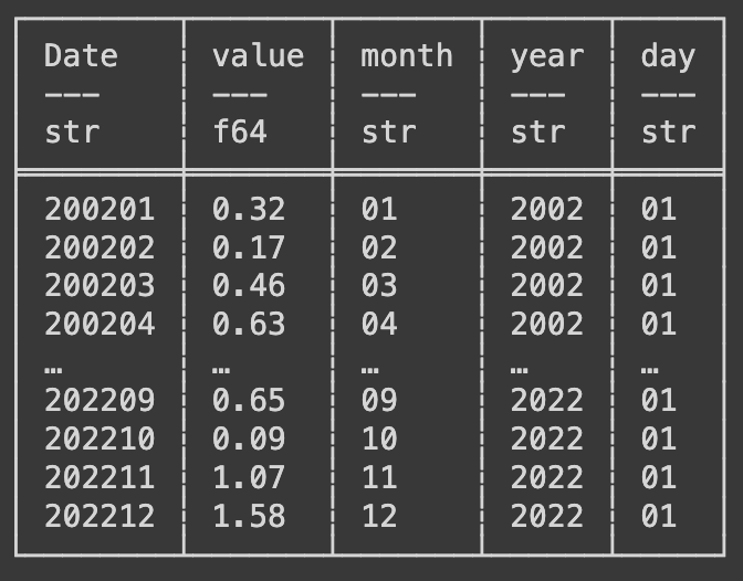
This code uses the with_columns() function and takes the Date column (pl.col(‘Date’)) and using the .str.slice() method takes we give the parameter of 4 to slice off the first four characters leaving just the month number. We attached to this method the .alias() method to give our new column a name. We then using a similar collection of functions and methods do the same to extract the year into a new column, we use instead the .str.replace() method and give it the argument (r”..$”, “”) to replace the last two charaters (the month number) with blank characters leaving just the year number. Finally we create a new column with the value of 01 in every row and name it day. Below is a print of the data frame after this manipulation.
Now we can finally create a new date column combining all the columns we just created. Write the following code next.
precip = precip.with_columns((pl.col('year') + "-" + pl.col('month') + \
                              "-" + pl.col('day')).alias('date'),)
print(precip)
Here we use the with_columns() function and we select each column we created for the year, month, and day and add a “-” in between them. Now we need to drop all the columns we dont need to have a data frame with just date and value. Write the following code next, this will use the with_column() function again and take the date column and apply the str.to_date() method converting our new column to a date data type. Then using the .drop() method we will delete or drop the columns we dont want.
precip = precip.with_columns(pl.col('date').str.to_date())
mo_avg = precip.drop('Date', 'year', 'day')
precip = precip.drop('Date', 'month', 'year', 'day')
precip = precip.select('date', 'value')
print(precip)
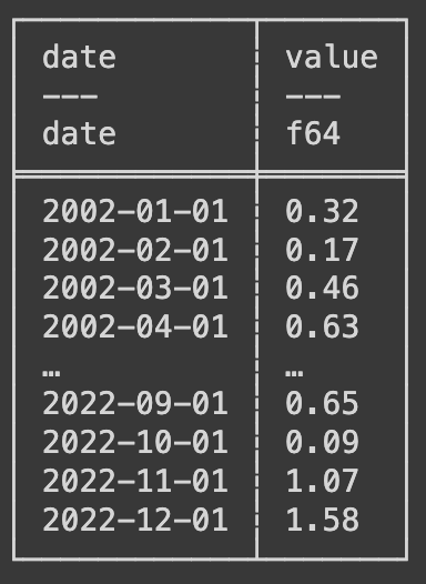
You may have notice by now that each time we perform a manipulation we start with “precip =”, this is because each manipulation is creating a new data frame and we are overwriting our original data frame. In the code above you may alos have notice a new data frame called mo_avg which will will use in just a short time to summarize and output our data. Below is an example of the data frame after all the manipulations.
Visualizing and Summarizing the Data
For this project we are using Seaborn which is a visualization libary similar to Matplotlib that we have used before. Write the following code next.
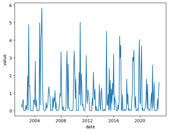
sns.lineplot(x='date', y='value', data=precip)
The output of the above code is a line graph showing all the data from our data frame, we used the date column as our x axis and the value as our y axis. Visualization like this can help us see the data instead of getting lost in a see of numbers.
Remember that mo_avg data frame we made earlier, now we will use it to summarize our data. Write the following code next.
mo_avg = mo_avg.group_by('month').agg(
    pl.col('value').mean().alias('avg_precip'),
    pl.col('value').min().alias('min_precip'),
    pl.col('value').max().alias('max_precip')
)
mo_avg = mo_avg.sort('month')
print(mo_avg)
We take our new data frame mo_avg and using the group_by() method we group all our data by the month number, the we use the .agg() method to aggregate the data. We take the column and use the .mean(), .min(), and .max() methods each time assigning a new column name using the .alias() method. We finally sort the data by month. Using the code below we write this new data frame to excel and using the colab file library we download it to our local machine.
mo_avg.write_excel('mo_avg.xlsx')
files.download('mo_avg.xlsx')
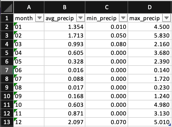
This is what the output of the mo_avg data frame looks like in Excel. We have all our newly created columns with the aggregate data month by month for the 20 year period we chose.
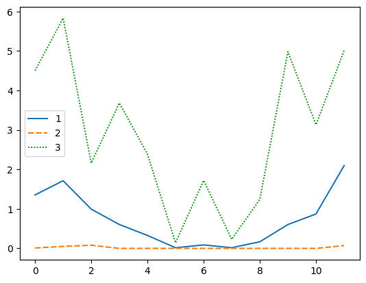
Last but not least we will graph the mo_avg data frame. This will show us the average monthly, minimum monthly, and maximum monthly precipitation for the each month of the 20 year period.
sns.lineplot(data=mo_avg)
Conclusion
In this article we grabbed some weather data spanning a period of 20 years, imported it into python using polars, manipulated the data for processing, aggregated the data to get the 20 yr. averages, minimum, and maximum per month, and visualized that data. Exploring weather data helps us make unformed decisions about project planning and gives us back up documentation for making the decisions we make.
Resources
The code used in this article can be found in the companion repository by clicking the button below.
