Introduction
First, just to be 100% clear the data used in this example is synthetic, this is data that was created for the purpose of this example, it should not be used to make actual adjustments. If you use this data for anything other than following along and practice, the results (probably bad) are your fault, 100% your fault.
Now lets assume for a minute that you work in an areas that has some hot summers and some cold winters (relatively), but the overall weather allows for you to work all year long. You notice that the amount of labor to perform a given task is different throughout the year. You decide to capture some data relating to this phenomenon so you can use it to adjust your estimates based on the time of year the work is planned to be done.
For this example we are not going to look at P values, T statistics, R values, or any of the typical regression statistics. We are looking to see if there is a trend and then draw a regression line through it to come up with a regression equation to use in making adjustments.
Setting up
To get started we need to install the required libraries. For this we are using pandas (which needs numpy) to create data frames, matplotlib to visualize the data, and SciKit Learn to perform the regression (SciKit Learn is a machine learning library). Write the following block of code to get started.
import numpy as np
import pandas as pd
import matplotlib.pyplot as plt
from sklearn.preprocessing import PolynomialFeatures
from sklearn.linear_model import LinearRegression
This example was written as a python script and not in a notebook, you can write it in a notebook if you’d like but you will need to modify the follow code based on the notebook you are using. Write the following block of code.
data_path = input("enter the path for the data:")
data = pd.read_csv(data_path)
We are creating a varibale called data_path and assigning it a user input by using the input() function. When the script is run the command prompt will print out the “enter the path for the data:” and wait for the user to enter a path for a csv containing the temperature and production data. Then we pass that data to the pandas read_csv() function to create a new dataframe that we called “data”. Next we want to see the data to get a feel for what it looks like. Write the following block of code next.
plt.scatter(x='Temp', y='Production', data=data)
plt.show()
Here we are using the scatter() function of matplotlib to create a scatter plot. Since we want the temperature to be the X axis and the production to be the Y axis so we assign them as such in the scatter() function. Then we print or show the plot using the show() function. Below is an example of the scatter plot using our synthetic data.
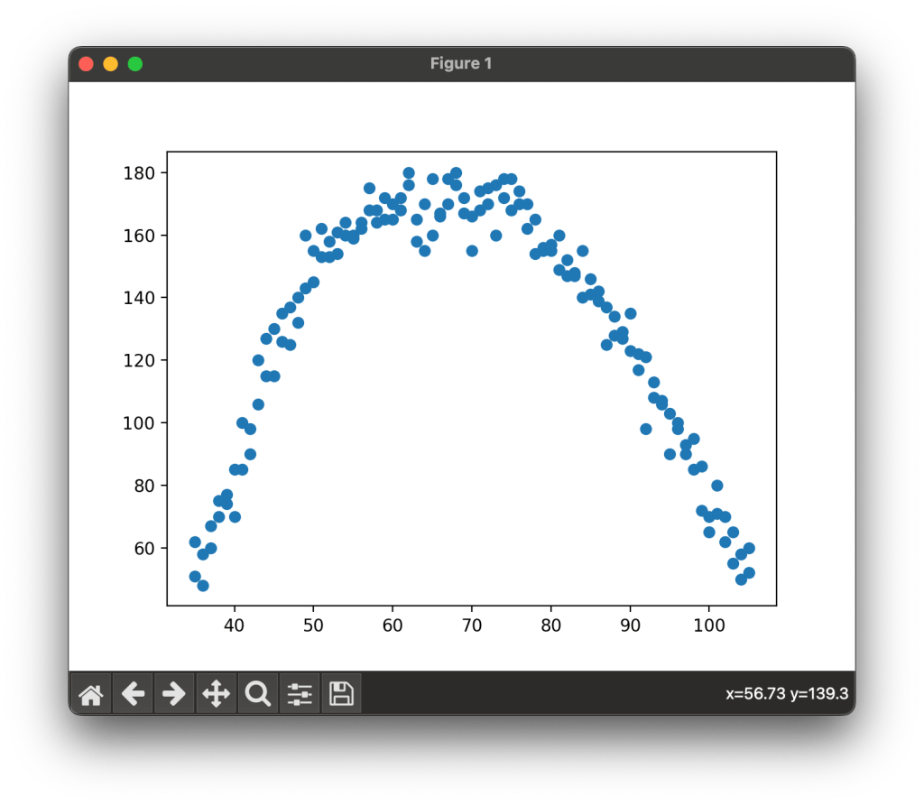
Notice that in our data production rises as temperature rises and reaches a max point around 60 to 80 degrees and then falls again as we go past 80 degrees. Since our data is not grouped in fashion that a straight line would pass through we need a polynomial or curved regression line to analyze this data. Write the following code block next.
X = pd.DataFrame(data['Temp'])
Y = pd.DataFrame(data['Production'])
To process our data using we want to split our data into two seperate datasets, one for the X axis and one for the Y axis. using the pandas DataFrame() function we pass in our data and state the column we want to use for our new dataframes. Next we need to create our polynomial feature and fit our data to it. Write the following code block next.
pn = PolynomialFeatures(degree=2, include_bias=False)
pnx = pn.fit_transform(X)
We wont get to far in the weeds here but what we are doing is creating a polynomial feature with two degress and we are not including bias. We then take this polynomial feature and using the fit_transfrom() function we are fitting the X axis data to this polynomial feature. Next we will perform the regression analysis. Write the following block of code next.
reg_model = LinearRegression()
reg_model.fit(pnx, Y)
pro_predict = reg_model.predict(pnx)

print("coefficients:", reg_model.coef_, "intercept:", reg_model.intercept_)
We created a variable called reg_model and assigned it the LinearRegression() function from SciKit Learn. We then take our X axis data that we trandformed using our polynomial feature and our Y axis data and fit them to a regression model. From there we use our data to predict the Y values using our regression model. Finally we print our intercept and coefficients ( we will use these future in another article).

Now lets visualize the data and our regression curve. Write the following code block next.
plt.scatter(X, Y)
plt.plot(X, pro_predict)
plt.show()
We againg create a scatter plot with our X and Y data, this is the data that has not yeat been transformed or fitting and is the original data from our dataset. We then plot a line using the X data and our predicted Y values from our regression model. Below is a sample of the output from this model.

And there you have it, we have a regression model that shows a fitted line that gives us details on the impact of temperature on labor productivity.
Conclusion
Tempearture and production are not the only things we can analyze this way, we could use all kinds of data. The main caution to take is that prior to any analysis you should ask yourself a simple question, does it make sense that one of these data points effects the other, if you do not have a logical reason as to why data point X affects data point Y then you need to do a lot more analysis first. It makes sense that as it getting hotter and colder labor production would decrease, it does not make sense that the birthrate in London has an impact on how many square feet can be painted in an hour in San Diego, but I bet with enough data cleaning and analysis you could show that it does, but that doesn’t make it a worth while analysis.
Resources
The code used in this article can be found in the companion repository by clicking the button below.
