
The Setup
When we write an estimate, budget, schedule, etc. we usually think about the amount of adverse weather we may face on the project. We add additional time and money to account for these items. Lets take a look at some historical weather related data and build a forecasting tool to give us an estimate on the amount of days our project will be impacted by rain. For this problem we are going to use R as our primary tool, if you are not familiar with R and would like to give it a try you can check Getting Started Part III to get an introductiom to R and then come back here and give it a try.
The Data
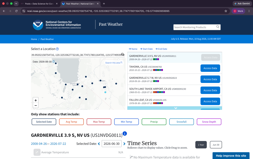
While there are plenty of places to get weather data from NOAA has fairly tidy data in CSV format that you can download HERE. Included in the repository is the data from Lake Tahoe (it is summer while writing this and a nice ice blue lake sounds very good right now).
The Libraries
For this example we are going to need quite a few libraries to process our data and get where we need to go. Below are the libraries you need to install and have loaded into your script.
library(fable)library(feasts)library(readr)library(dplyr)library(tibble)library(tsibble)library(tidyr)library(lubridate)library(ggplot2)
Staging our Data
So to get started we need to define a rain day, now I live on the west coast so for us it is defined as 3 drops of water within a 3 foot diameter circle1. Depending on where you project is, and the weather your organization is accustomed to working in, this definition will vary. For this example we are using 0.25 inches of rainfall as our threshold for a rain day. From there we need to bring in our data and create a time series data table. The code below will do all three of these items.
rain_thresh = 0.25rain <- read_csv("data.csv", skip = 1)rain_ts <- tsibble(rain)
Note: If you open the csv in excel or some other spreadsheet software you will notice there is a row above the data that states where the data is from. The “skip = 1” part of the code is what skips this row. For this example we are using a tsibble as our time series data table. This makes the time related column the index for the data.
Exploring our Data
Now that we have our data into our environment we can start exploring it and seeing what we got. First we want to change the time periods to monthly and then sum up all the data for each month. After we have done that we will plot the data and take a look.
rain_mo <- rain_ts %>% index_by(Month = ~ yearmonth(.)) %>% summarise(ttl_rain = sum(`PRCP (Inches)`, na.rm = TRUE))ggplot(rain_mo, aes(Month, ttl_rain)) + geom_line(color = "Purple")
The first section of the proceeding code takes our data and passes it to the index function which makes a month column and collapses our time data into monthly data, from there it is passed to the summarise function which sums up all the rain data for each month. Then we plot the data using the month as our x axis and the total rain as our y axis and we change the color of our line graphs to purple2.
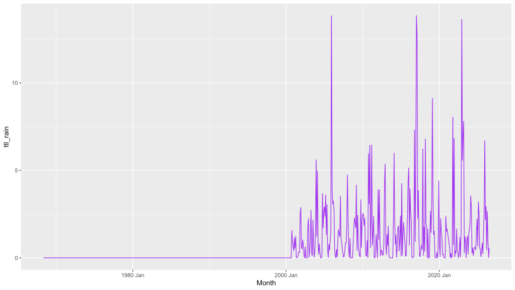
As you can see from the output the chart has no data until somewhere around the year 2000. Now if you wanted to use data from that far back in your forecast you will need to grab a different dataset.
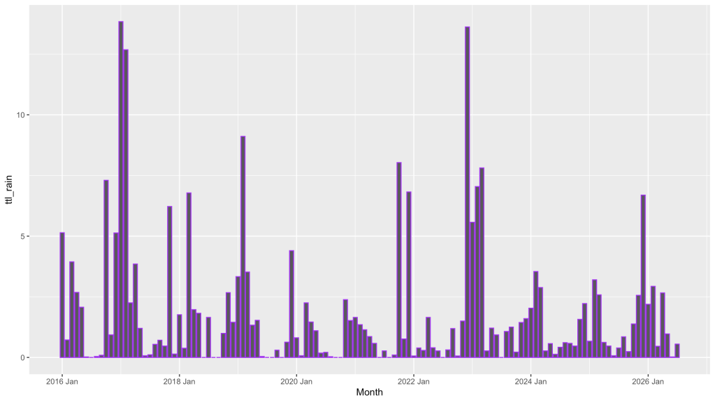
For this example we are going to grab just the last 10 years of data. We take our data and create a new data table and filter that data to only include data after 1/1/2016. We then index that by month and summarise the rain data just like before and from there we again plot our data, this time using columns instead of the line.
rain_mo <- rain_ts |> filter(!(Date <= as.Date("2016-01-01"))) %>% index_by(Month = ~ yearmonth(.)) %>% summarise(ttl_rain = sum(`PRCP (Inches)`, na.rm = TRUE))ggplot(rain_mo, aes(Month, ttl_rain)) + geom_col(color = "purple")
Now we have a chart that shows us the monthly rainfall from our data in the time range we wanted.
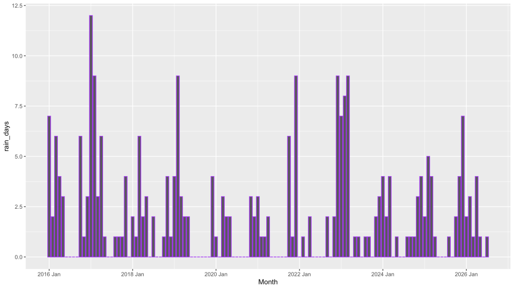
But for our forecast we want to know the number of rain days not the amount of rain. We need to process the data differently. Using almost the same code as before we summarise the rain data by our rain threshold. This will count the number of times the rain has exceeded this number and give us a count of rain days.
rain_count <- rain_ts |> filter(!(Date <= as.Date("2016-01-01"))) %>% index_by(Month = ~ yearmonth(.)) %>% summarise(rain_days = sum(`PRCP (Inches)` > rain_thresh, na.rm = TRUE))ggplot(rain_count, aes(Month, rain_days)) + geom_col(color = "purple")
Building a Forecasting Model
There are no shortage of ways to forecast using R or any other language, excel has some forecasting tools, there are special forecasting softwares, etc. I would highly recommend check out different methods and trying different models to see what works best for a given scenario. For this we are using fable and its built in ARIMA forecasting model. ARIMA stands for Autoregressive Integrated Moving Average (say that five times fast) and its a popular tool for forecasting time series data. If you want to learn more about the math behind this method I would recommend Forecasting Principles & Practice which is a fantastic book on the subject.
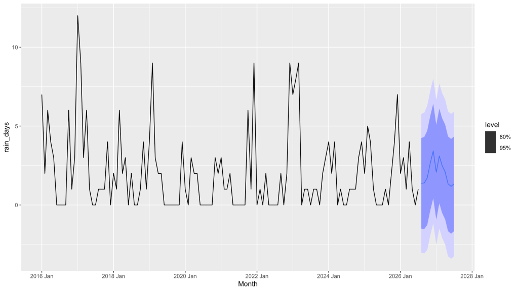
First we need to fit our data by passing it to the ARIMA function. From there we will take our fit and create a forecast. Once we have done that we can use the autoplot function to see the results.
fit <- rain_count %>% model(forecast_model = ARIMA(rain_days))forecast <- fit %>% forecast(h = "12 month")autoplot(forecast, rain_count)
Your output should look something like this. We can see our historical data from the dataset we pulled in and we can also see a forecast of what our model is producing. The light and dark blue bars are our 95% and 80% confidence intervals and the blue line is the mean.
Visualizing our Forecast
Now that we have that done we can do some preparation work for a more final visual that will help us see our forecast better. First we need to pull our the distribution data from our model and get our 95% and 80% intervals. Using the code below we will pull out the intervals (the mutate part does the pulling the hilo part does the getting the intervals) , we then make a new column for rain_days and pass our mean to that, add another column for type (this is so we can distinguish between the historical and forecast), unpack the intervals, and select our columns.
rain_forecast <- forecast %>% rename(rain_days_model = rain_days) %>% mutate(int_95 = hilo(rain_days_model, 95), int_80 = hilo(rain_days_model, 80), rain_days = .mean, type = "Forecast") %>% as_tsibble() %>% unpack_hilo(c(int_95, int_80)) %>% mutate(int_95_lower = pmax(0, int_95_lower), int_80_lower = pmax(0, int_80_lower)) %>% select(Month, rain_days, type, int_95_upper, int_95_lower, int_80_upper, int_80_lower)
Note: If you are asking why the rename() function, the original model already has a column called rain_days but I wanted to have that be the mean so it was renamed so that the column name rain_days could be uniform across the historical and forecast data.
Now that we have our forecast data with our new columns we need to add columns to the historical so the columns match there as well. Since the intervals do not apply we will simply use the mutate function and add columns and make them all equal to the rain_day, we also add a type to this data table as well.
rain_count <- rain_count %>% mutate(int_95_upper = rain_days, int_95_lower = rain_days, int_80_upper = rain_days, int_80_lower = rain_days, type = "Historical")
Now we need to check our work and see how things are coming along. I am a huge proponent of continually plotting the data to see how things look and to make sure there is not an error in the data processing. For this plot we will use bindrows() to combine our two data tables (the forecast and the historical). We then pass that data to ggplot() set our x and y axis and our fill to type (this is what separates the historical and forecast). Then we add our columns and give them separate colors. Add a title and change the axis names and we are off to the races.
bind_rows(rain_count, rain_forecast) %>% ggplot(aes(x = Month, y = rain_days, fill = type)) + geom_col() + scale_fill_manual(values = c("Historical" = "purple", "Forecast" = "blue")) + labs(title = "Rain Day Forecast", x = "Date", y = "Days w/Rain over 0.25 in") + theme(legend.title = element_blank())
Note: The theme(legend.title = element_blank() turns off the series title, without this above the Forecast and Historical legend (off to the right side) it would say “type”.
And BOOM, we got a chart with columns that show our historical data alongside our forecast data.
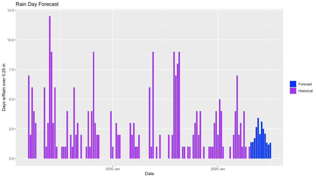
Now we could stop right here, right now. However, we can all agree this chart needs to be a little more impactful, maybe have some more data on it to help the viewer, maybe show those confidence intervals. Lets do it.
To make things a bit smoother on us lets formally combine our two data table into one by creating a new table and using bind_rows()
rain_data <- bind_rows(rain_count, rain_forecast)
For fun lets add a text block at the top of our chart with some of our metrics, say the total amount of forecasted rain days (our mean), and then same for our confidence interval rain days.
forecast_ttls <- rain_forecast %>% as_tibble() %>% ungroup() %>% summarise(ttl_mean = round(sum(rain_days), 1), ttl_95_up = round(sum(int_95_upper), 1), ttl_95_low = round(sum(int_95_lower), 1), ttl_80_up = round(sum(int_80_upper), 1), ttl_80_low = round(sum(int_80_lower), 1))
Note: The ungroup() function breaks apart any groups that the tsibble may have created this allows us to summarise the data into single metrics. I learned this the hard way by not having it and getting back a table with multiple rows of data instead of one line. I finally capitulated and asked jeeves3.
With our metrics all set up we can now add that data to an object, we use the paste0() function to concatenate our metrics.
ttl_metrics <- paste0( "Forecast Metrics:\n", "Mean: ", forecast_ttls$ttl_mean, " days\n", "80% CI: ", forecast_ttls$ttl_80_up, " days\n", "95% CI: ", forecast_ttls$ttl_95_up, " days\n")
Note: If you are curious about the “\n” throughout this section of code that is what tells the code to start a new line so instead of having one long sentence we get a stack of metrics. Its like the code version of the ENTER (RETURN) key.
Now for the final stretch. Here we are going to use ggplot() and give it all our data and how we want it laid out and get a nice graph that shows all our hard work. To start we give our data to ggplot, then using the aes() function we set our axes. We then add a geom_linerange() for our intervals, for these we filter for just our forecast data, for these we will use alpha to make this data slightly transparent. Next we add our columns using geom_col() and we use fill = type to distinguish between historical and forecast. Lets add some error bars using geom_errorbar() and again filter for our forecast data. We then use the scale_fill_manual() to state which colors we want for our historical and forecast data. For the fun parts, we use annotate() to add our text box containing our metrics, we use the labs() to set our title and axis labels, and finally we use theme() to remove the gray background, the tick marks, the legend title, and we give a slight gray line to the major horizontal ticks.
ggplot(rain_data, aes(x = Month, y = rain_days)) + geom_linerange(data = filter(rain_data, type == "Forecast"), aes(ymin = int_95_lower, ymax = int_95_upper), color = "skyblue", alpha = 0.4, linewidth = 2) + geom_linerange(data = filter(rain_data, type == "Forecast"), aes(ymin = int_80_lower, ymax = int_80_upper), color = "steelblue", alpha = 0.5, linewidth = 2) + geom_col(aes(fill = type)) + geom_errorbar(data = filter(rain_data, type == "Forecast"), aes(ymin = int_95_lower, ymax = int_95_upper), color = "darkblue", alpha = 0.8) + scale_fill_manual(values = c("Historical" = "purple", "Forecast" = "blue")) + annotate( "text", x = max(rain_data$Month), y = Inf, label = ttl_metrics, hjust = .85, vjust = 1.1, size = 4) + labs(title = "Rain Day Forecast", x = "Date", y = "Days w/Rain over 0.25 in") + theme(legend.title = element_blank(), panel.background = element_blank(), plot.background = element_blank(), axis.ticks = element_blank(), panel.grid.major.y = element_line(color = "gray95"))
Once executed you should have a chart that looks alot like this. We have our historical data, our forecast, our confidence intervals and our metrics all in one place. Now this may not be the best looking chart out there but we were after a forecast of our potential rain days and this tells us what we need to know.
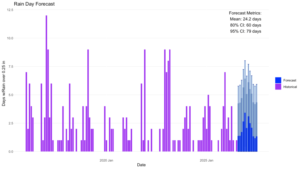
From here you should play around with changing the amount of data used (try 5 years and 20 years and see the impact), Explore getting the data for temperature and humidity and then doing a regression to see if you can make a more accurate model. For fun when I completed this I ran a google search for average rain days in a calendar year for Lake Tahoe and the result was 50 to 75 days. While maybe a google search is all you need this will give you the ability to run this model for any area you can get data for and adjust the confidence intervals and see the data for yourself.
The Completed Code
library(fable)library(feasts)library(readr)library(dplyr)library(tibble)library(tsibble)library(tidyr)library(lubridate)library(ggplot2)rain_thresh = 0.25rain <- read_csv("data.csv", skip = 1)rain_ts <- tsibble(rain)rain_mo <- rain_ts %>% index_by(Month = ~ yearmonth(.)) %>% summarise(ttl_rain = sum(`PRCP (Inches)`, na.rm = TRUE))ggplot(rain_mo, aes(Month, ttl_rain)) + geom_line(color = "Purple")rain_mo <- rain_ts |> filter(!(Date <= as.Date("2016-01-01"))) %>% index_by(Month = ~ yearmonth(.)) %>% summarise(ttl_rain = sum(`PRCP (Inches)`, na.rm = TRUE))ggplot(rain_mo, aes(Month, ttl_rain)) + geom_col(color = "purple")rain_count <- rain_ts |> filter(!(Date <= as.Date("2016-01-01"))) %>% index_by(Month = ~ yearmonth(.)) %>% summarise(rain_days = sum(`PRCP (Inches)` > rain_thresh, na.rm = TRUE))ggplot(rain_count, aes(Month, rain_days)) + geom_col(color = "purple")fit <- rain_count %>% model(forecast_model = ARIMA(rain_days))forecast <- fit %>% forecast(h = "12 month")autoplot(forecast, rain_count)rain_forecast <- forecast %>% rename(rain_days_model = rain_days) %>% mutate(int_95 = hilo(rain_days_model, 95), int_80 = hilo(rain_days_model, 80), rain_days = .mean, type = "Forecast") %>% as_tsibble() %>% unpack_hilo(c(int_95, int_80)) %>% mutate(int_95_lower = pmax(0, int_95_lower), int_80_lower = pmax(0, int_80_lower)) %>% select(Month, rain_days, type, int_95_upper, int_95_lower, int_80_upper, int_80_lower)rain_count <- rain_count %>% mutate(int_95_upper = rain_days, int_95_lower = rain_days, int_80_upper = rain_days, int_80_lower = rain_days, type = "Historical")bind_rows(rain_count, rain_forecast) %>% ggplot(aes(x = Month, y = rain_days, fill = type)) + geom_col() + scale_fill_manual(values = c("Historical" = "purple", "Forecast" = "blue")) + labs(title = "Rain Day Forecast", x = "Date", y = "Days w/Rain over 0.25 in") + theme(legend.title = element_blank())rain_data <- bind_rows(rain_count, rain_forecast)forecast_ttls <- rain_forecast %>% as_tibble() %>% ungroup() %>% summarise(ttl_mean = round(sum(rain_days), 1), ttl_95_up = round(sum(int_95_upper), 1), ttl_95_low = round(sum(int_95_lower), 1), ttl_80_up = round(sum(int_80_upper), 1), ttl_80_low = round(sum(int_80_lower), 1))ttl_metrics <- paste0( "Forecast Metrics:\n", "Mean: ", forecast_ttls$ttl_mean, " days\n", "80% CI: ", forecast_ttls$ttl_80_up, " days\n", "95% CI: ", forecast_ttls$ttl_95_up, " days\n")ggplot(rain_data, aes(x = Month, y = rain_days)) + geom_linerange(data = filter(rain_data, type == "Forecast"), aes(ymin = int_95_lower, ymax = int_95_upper), color = "skyblue", alpha = 0.4, linewidth = 2) + geom_linerange(data = filter(rain_data, type == "Forecast"), aes(ymin = int_80_lower, ymax = int_80_upper), color = "steelblue", alpha = 0.5, linewidth = 2) + geom_col(aes(fill = type)) + geom_errorbar(data = filter(rain_data, type == "Forecast"), aes(ymin = int_95_lower, ymax = int_95_upper), color = "darkblue", alpha = 0.8) + scale_fill_manual(values = c("Historical" = "purple", "Forecast" = "blue")) + annotate( "text", x = max(rain_data$Month), y = Inf, label = ttl_metrics, hjust = .85, vjust = 1.1, size = 4) + labs(title = "Rain Day Forecast", x = "Date", y = "Days w/Rain over 0.25 in") + theme(legend.title = element_blank(), panel.background = element_blank(), plot.background = element_blank(), axis.ticks = element_blank(), panel.grid.major.y = element_line(color = "gray95"))
As always remeber that the only true limit on what you can create is your imagination. Be creative, have fun, break things, and try different methods.
Resources
The code used in this articles can be found in the companion github repository by clicking the button below.

