
PowerBI?
If you are new to PowerBI its a business intelligence tool that helps you clean, transform, explore, and visualize data. If you want to learn a bit more of the basics check out the Getting Started Part VI article HERE.
Setting up our Data
In this example we have three budgets/estimates that we have created. One when we first estimated the job, a second when we were asked to make some changes, and a third when we got more changes. We were asked to show the differences in the overall cost between the estimates and we want a way to visualize this in a way that helps the conversation and doesn’t distract with too much information1.
In the example data we have three budgets in excel and they are already in table form. If you are using your own data it will need to be in table form so we can bring in the data. There are alternatives to using tables but those wont be covered here.
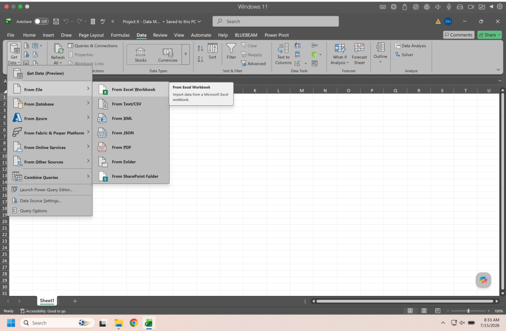
Create a new spreadsheet to house your data. This can just be a fresh blank spreadsheet. In the Data tab you will import your data from an excel workbook, navigate to your spreadsheet or the example data and open it.
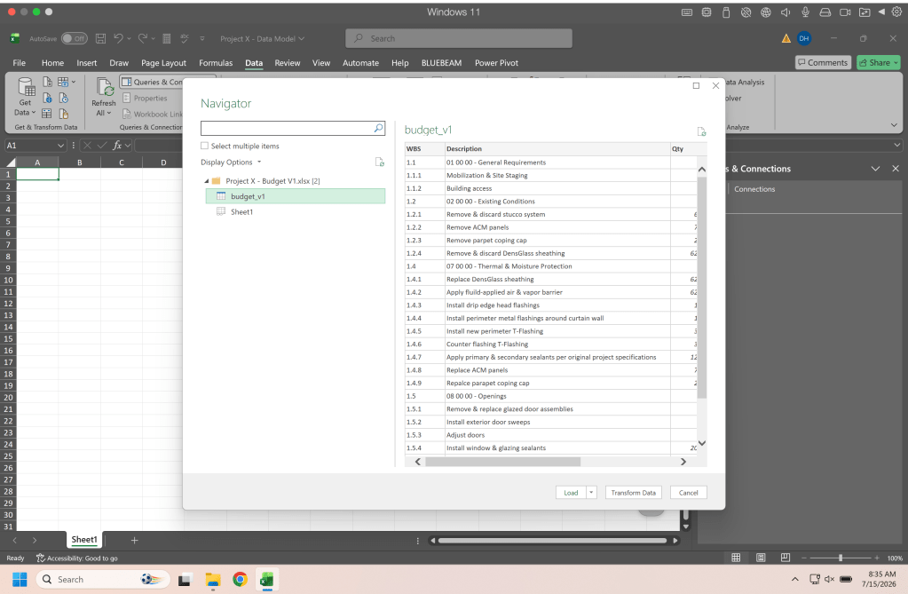
When you open the workbook you are connecting you will see your sheets and tables listed. Select the table you want to import and click close and load to (this is in the drop down next to load).
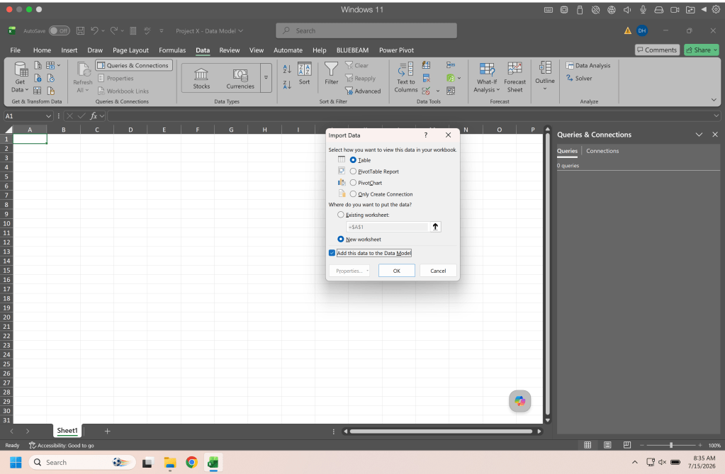
This will bring up a dialog box where you make your import selections. For this example we want to bring in a table and add the data to our data model.
Once we make our import setting selections power query will bring in a table to the spreadsheet. This table is connected to the other sheet through power query and any changes you make on the source sheet can be brought into this new workbook through a refresh.
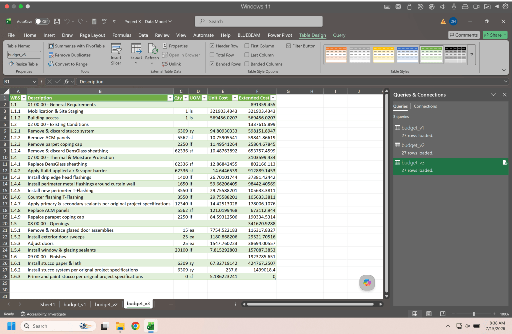
Continue with the other three tables of estimates so you have all three estimate tables in your workbook.
Stacking the Data
Now I am sure there is another way to do this and probably a way to do this directly in PowerBI, however, this is how I do it and it helps me follow the data.
In a blank work sheet somewhere around cell B3 you will enter a VSTACK() formula. This formula will bring in the data from your budget tables and stack them one on top of the other.
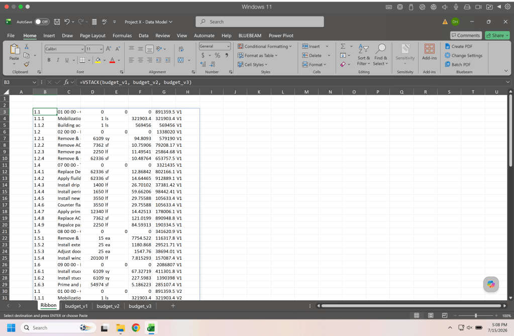
=VSTACK(budget_v1, budget_v2, budget_v3)
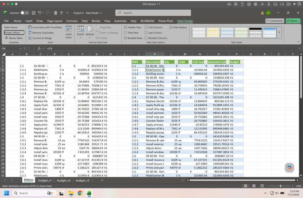
Copy the headers from one of the budget tables and create a new table next to the data that the VSTACK() formula brought in and link the data from the VSTACK() to your new table. The reason for this is that VSTACK() is an array function so it spills data down the sheet which is not a function that a table allows so your need to have the data off to the side and link or reference (“=”) the data into your table.
Bringing our Data to PowerBI
Once you have your data (make sure all your tables have names you can understand) it time to bring that into PowerBI. If you have a Microsoft license it is likely you can download and use PowerBI desktop for free.
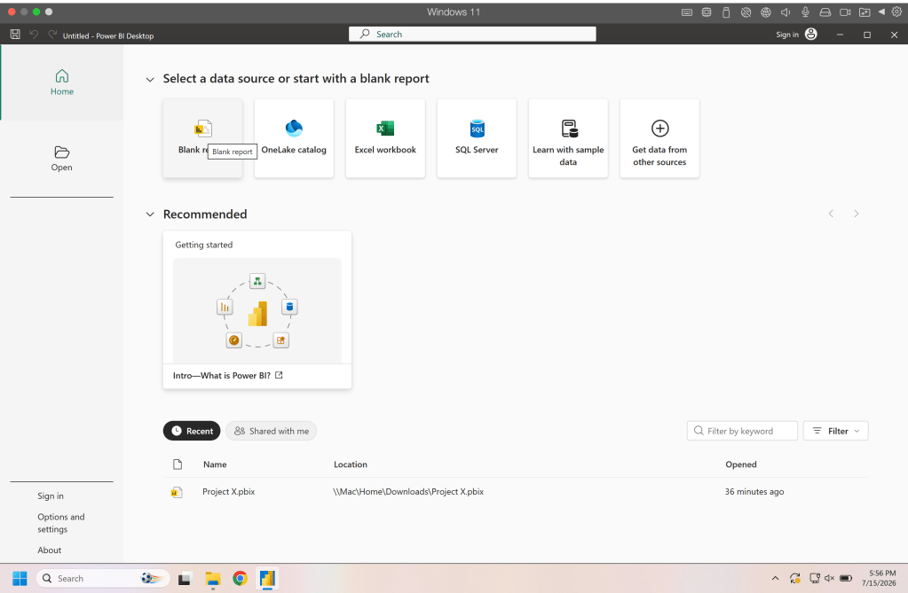
When you start up PowerBI you will have several options to get started, select blank report.
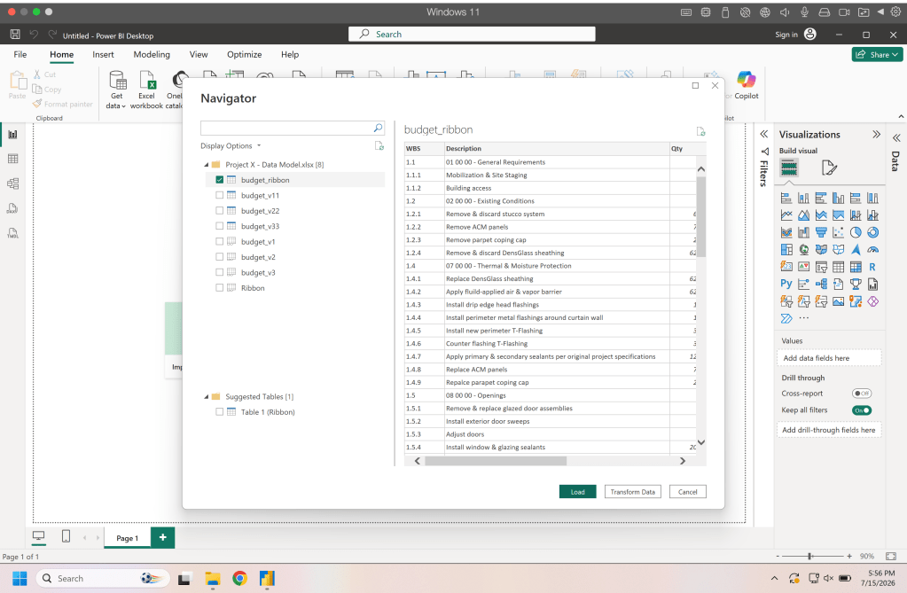
Select excel work book from the ribbon to begin importing data from excel and navigate to the workbook we just made. When you open it you will see the tables you brought in along with the table made with the VSTACK(), select this table and click load.
Once the data is loaded in the side bar you will see a table icon that takes your to table view where you can view your data and begin making any changes needed.
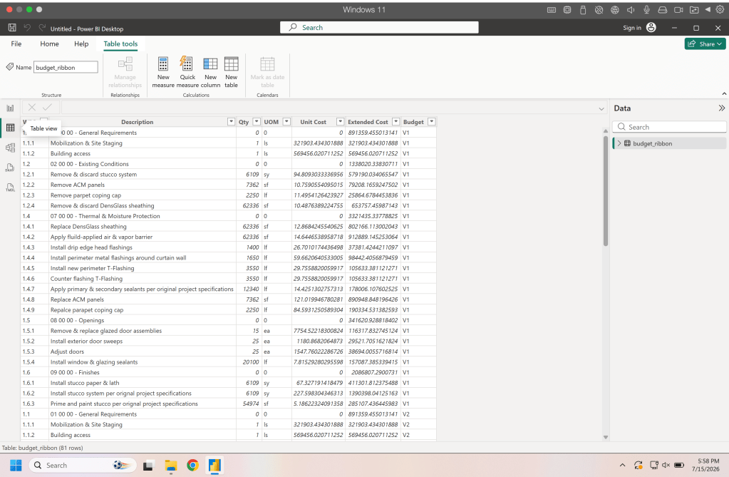
To use the data we have we need to add a column so we can separate the headers (estimate headers general conditions, existing conditions, etc.) from our line items. In the ribbon in the table view click on new column.
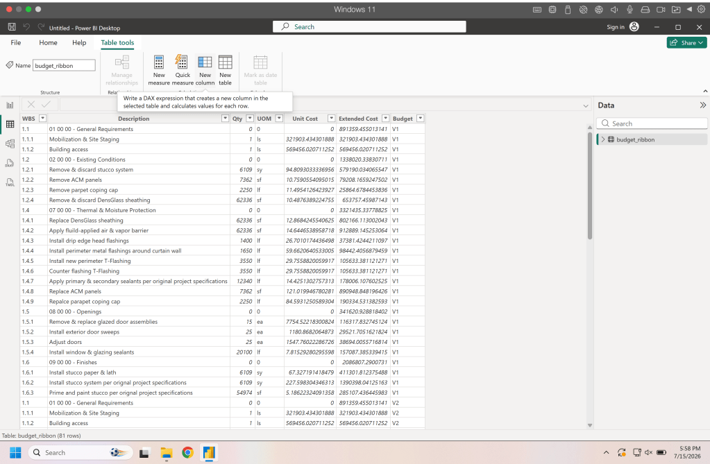
This will add a new column and the formula bar will be active and ready to take a function for the column. Here we want to name our column which is the text before the equal sign (=), then we need to tell the column what it is calculating. Here we want to create two levels, one for the headers and one for line items. Using our WBS codes we can see that all our headers have no more than three characters (1.1, 1.2, etc.) and our line items all have more than three characters (1.1.1, 1.1.2, etc.). To separate these we write an if function that tests the length of the WBS and returns a 1 for headers and a 2 for line items.
Level = IF(LEN(budget_ribbon[WBS])=3, 1, 2)
Once we have that done we get to the fun part of creating our visual.
Visualizing our Data
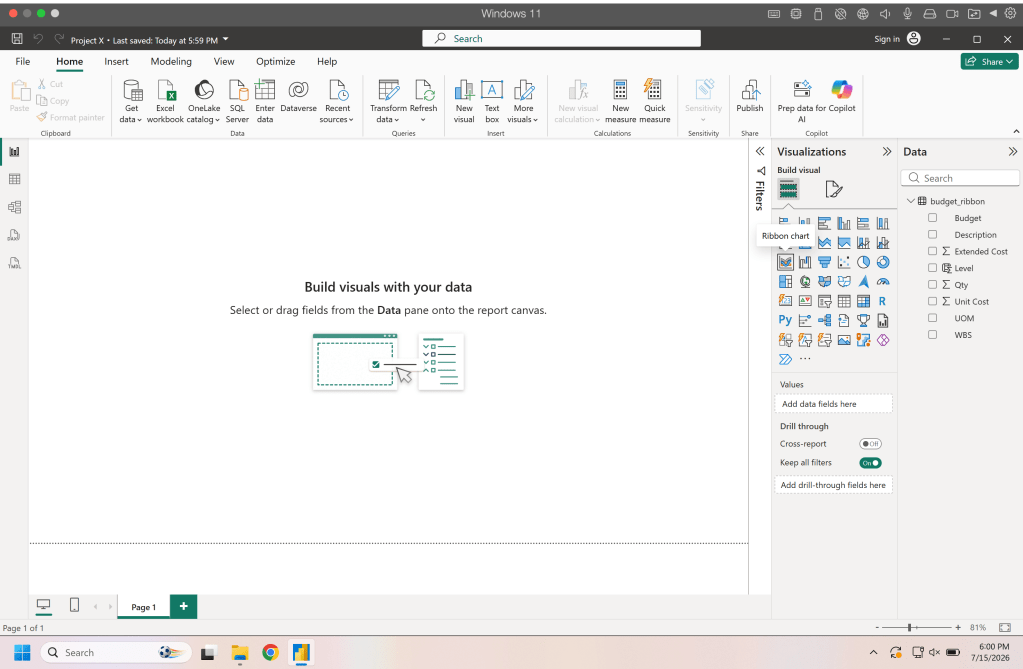
Lets get to building a visualization for this data. In the side panel (right hand side) you will see a bunch of icons all representing different visualizations. For this we will select the Ribbon Chart.
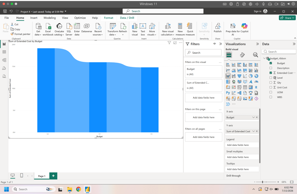
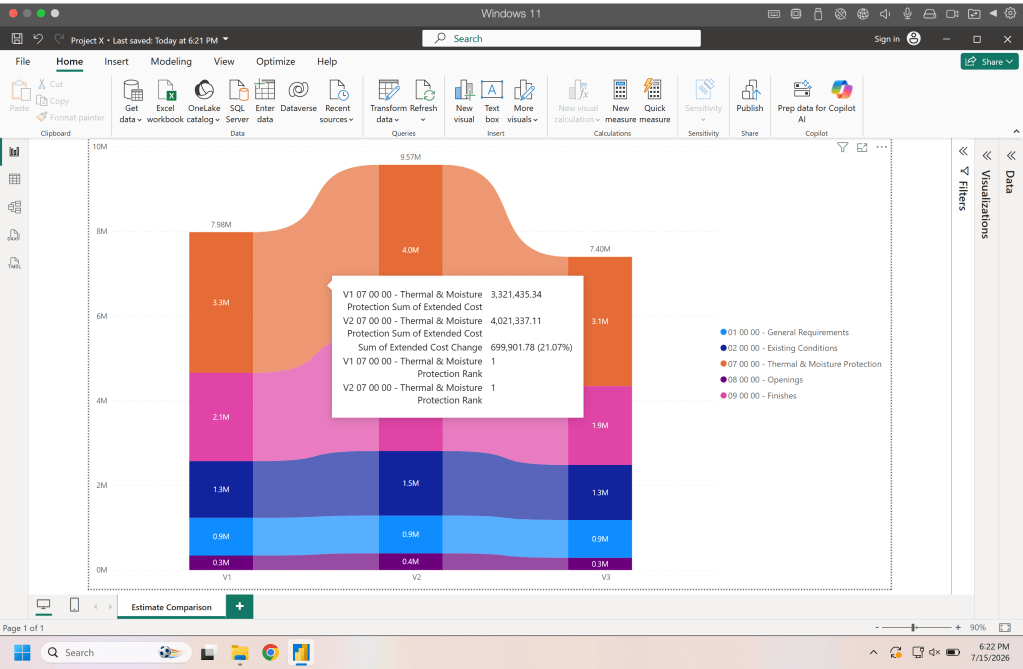
Once you have your ribbon chart in the field (the large center area, probably has a cooler name than the field but thats what we are going with today). Drag the Budget down the the X axis field and the Extended Cost down to the Y axis field (these items are in the Data panel and the fields are in the visualization panel, they are side by side). This will populate the ribbon chart which should look something like this.
Now grab the description and drag that down into the legend field which will split your ribbon chart into ribbons based on the extended cost of the different descriptions.
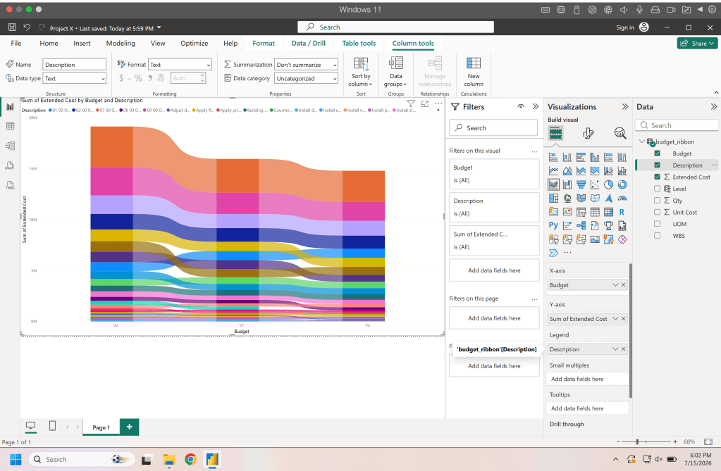
But what we have now is far too confusing and its too much information in one chart. So remember that level column we made, drag the level from the data panel into the filter panel to add a filter for the level. If not already active change the filter to basic and select level one and you chart should just show the division headings now.
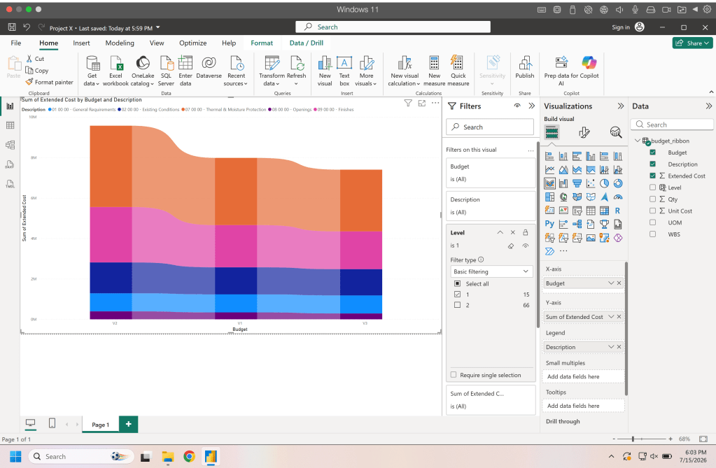
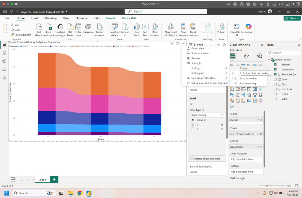
Now the data may be in a strange order. If you look at the image above youll see we dont have V1, V2, and V3 in the order we want they are in order based on the total. To change this we click the three dots at the top of the chart and sort by budget instead of extended cost. From there if needed change the sort from ascending to descending or visa versa.
From here we need to just do some cleanup on the chart, lets turn off the X & Y titles.
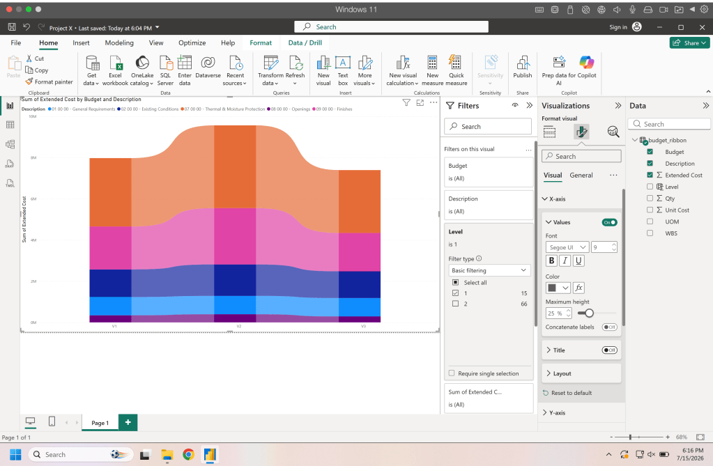
Now lets move the legend off to the side. This is optional you can leave it at the top move it to the bottom, right side, left side, etc.
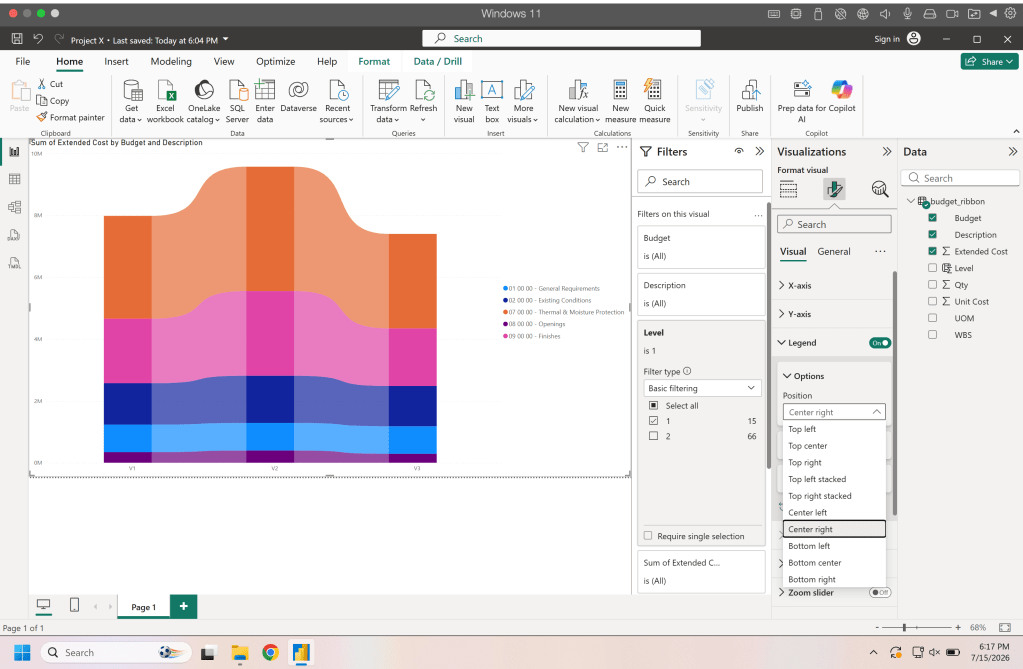
Lastly in the visual section lets add data labels to the ribbons and a total.
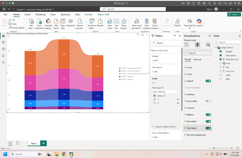
Finally turn off the title to get the most real estate for the graph.
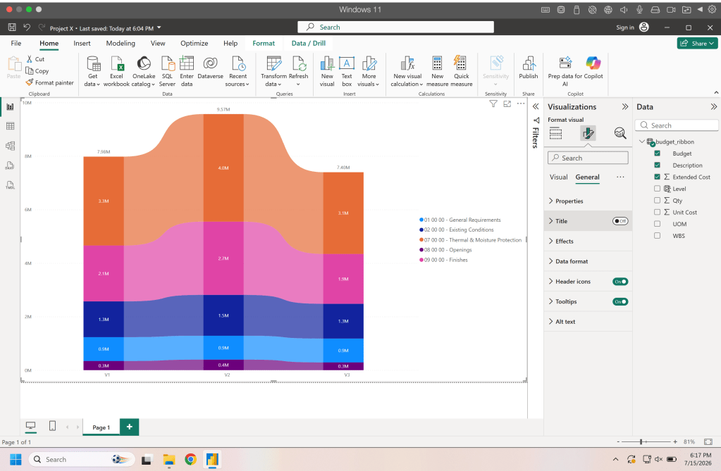
Boom we now have a clean chart that tells the story of the changes in our estimate/budget visually.
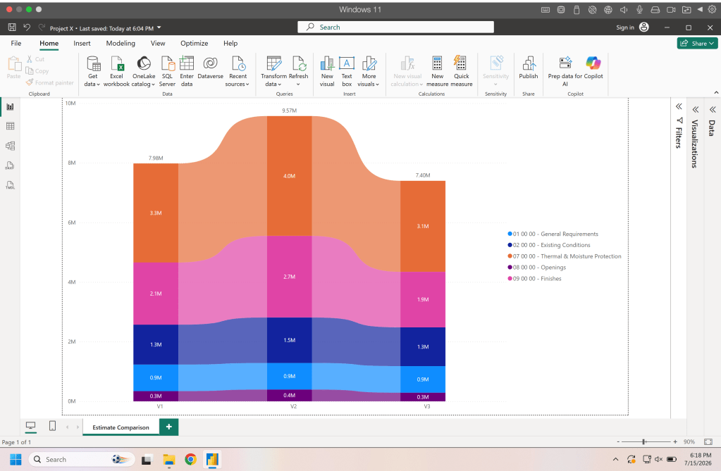
You will notice that if you hover your mouse over the different ribbons you will see the total of the two estimates in that ribbon and the difference. Play around hovering around the graph to see how the data changes.
Creating a Matrix
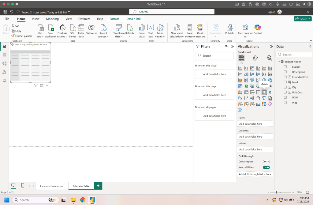
Well we have a cool looking chart but deep down we know we are gonna get questions about the underlying data and someone is eventually gonna want to see something that looks like a spreadsheet. Lets create a new page in the report and add the matrix visual to the page.
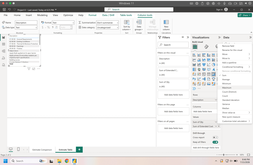
Drag the description to the rows field, the qty and extended cost to the values field. Once that is done you will want to right click on the qty & extended cost in the values field and click rename for this visual so that it doesn’t show “sum of” in front of the name.
Now may be a good time to expand the chart/matrix to fill the page if you haven’t already. Next drag the budget data into the columns field. This will give you a column for each budget containing the qty and extended cost for each.
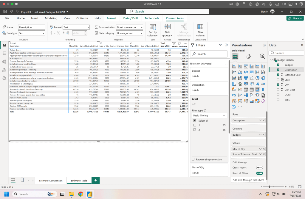
Now for this matrix we don’t need to have the row totals so we can turn those off along with the column totals as well.
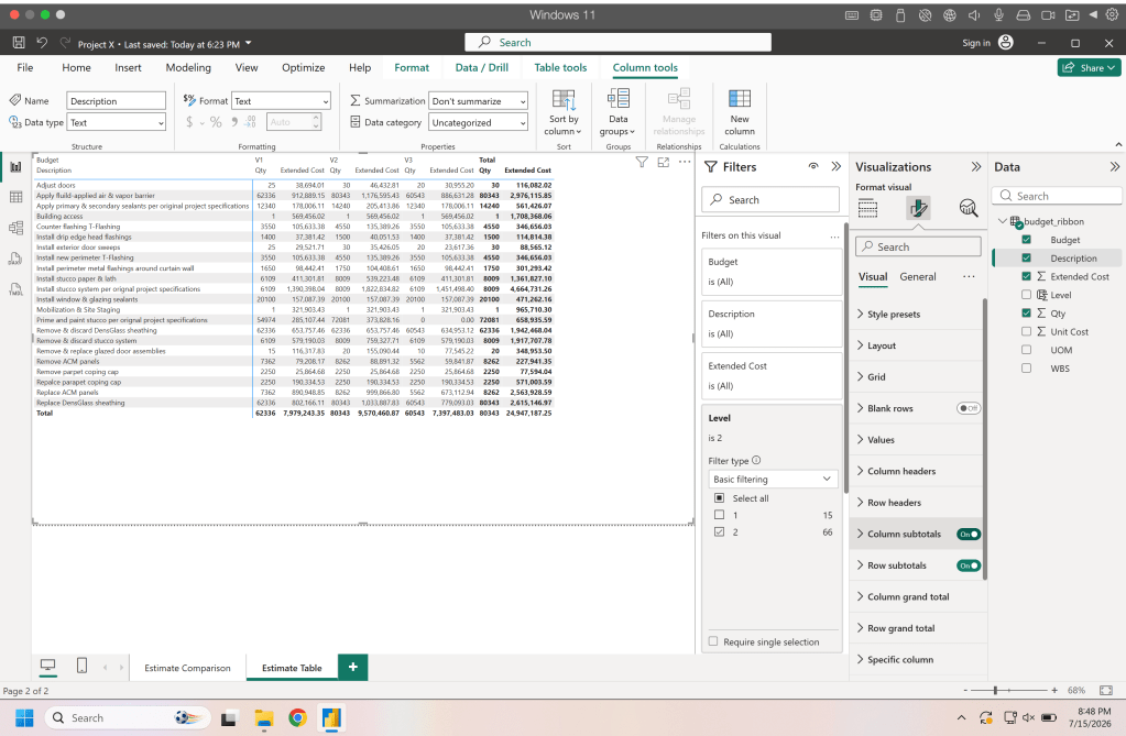
Lastly in the layout field change the auto size behavior to grow to fit to adjust the matrix to fill the page.
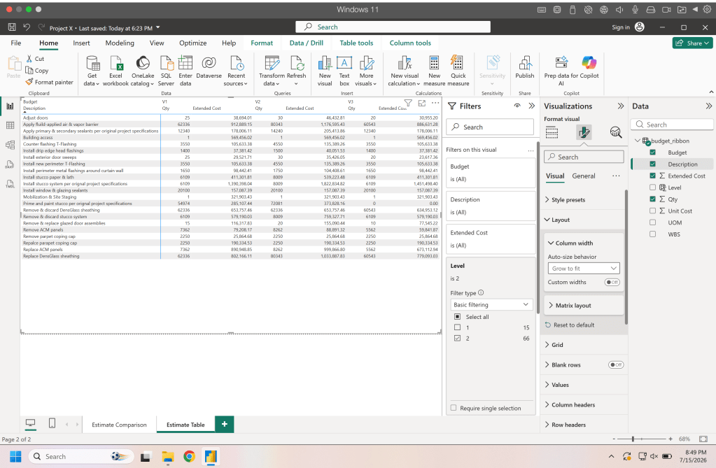
And Boom again now we have both a colorful chart and a matrix to show the changes in our data.
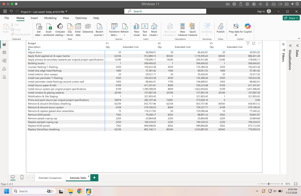
Please play around with these charts, use your own data, change the colors, add more details. Have fun visually exploring your data.
Resources
The code and notebooks used in this articles can be found in the companion github repository by clicking the button below.
- For the curious among us, this is something I do very frequently. Using a visual to show changes between estimates help get the conversation started and it is far easier to see changes in a chart than it is in a spreadsheet or table. Since we have the background data we can answer any questions but the chart helps everyone see the data and keeps the conversation moving. ↩︎

