
PowerBI
Even if you have never heard of PowerBI it is highly likely you have seen a report, dashboard, graph, or chart that was built with it. PowerBI is a powerful tool that lets you import, clean, transform, manipulate, process, and visualize your data. This allows you to create dynamic reports and dashboards. This guide is designed to give you a basic understanding of how PowerBI. If you have a Microsoft accounting and use the usual suite of office tools (such as word, outlook, and excel) you most likely have access to PowerBI desktop which you can download from Microsoft.
Getting Data
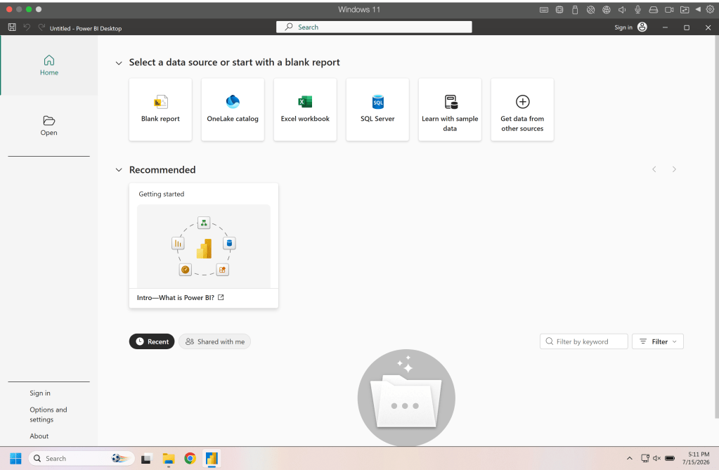
When you first open PowerBI you’ll notice that you can right away select data from different sources. For this guide we are going to select Blank Report so we can explore getting data from different sources.
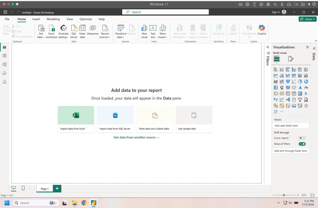
When you have a blank report you’ll notice that in the center stage there are options for importing data and there are also options in the Data section of the ribbon. Lets start by manually entering some data, this is uncommon but good to see how it stores data. Click on paste data into a blank table.
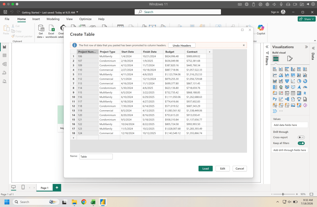
This will open up a window that allows us to past data into a table. In the Getting Started data in the repository there is a summary table with our project information that we can paste in here. Make sure that the top row gets promoted to headers. Once we have this pasted in we click load to bring in the data.
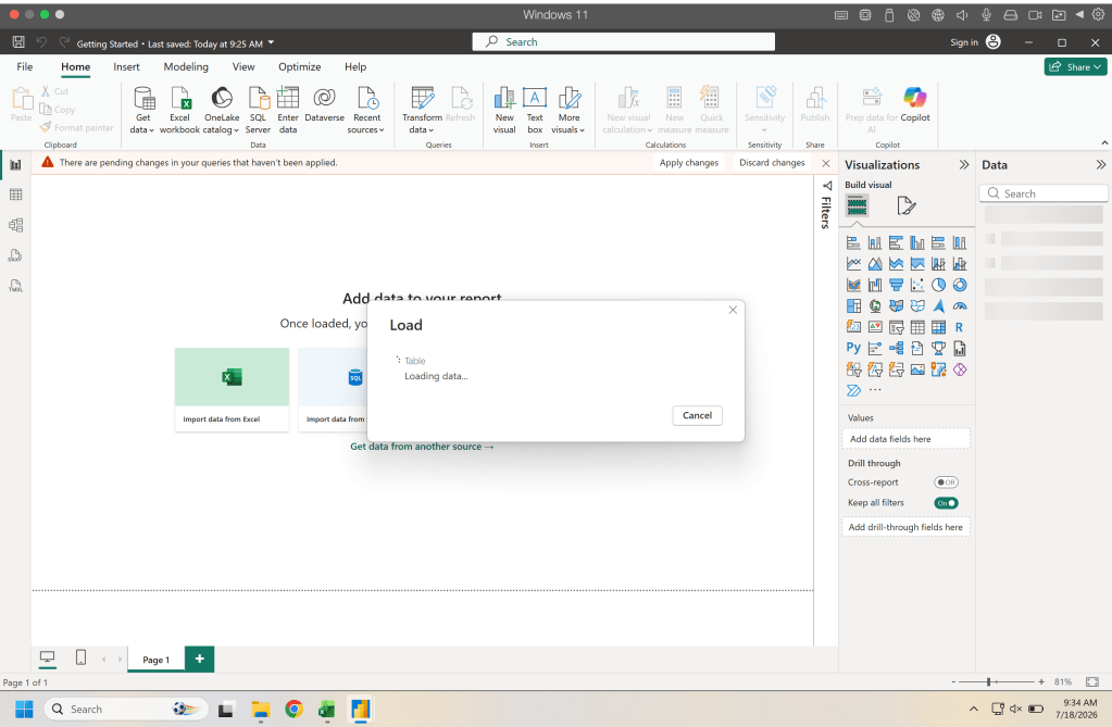
When you load any data you will most likely see a loading window and a red bar that tells you there are pending changes. Don’t fret this is temporary while the data is loading and the bar will disappear normally after the import (if it doesn’t hit refresh).
You will now see a table in the data pane on the right hand side of the application window. We need to transform some of this data and also rename our table so we can easily remember whats in it.
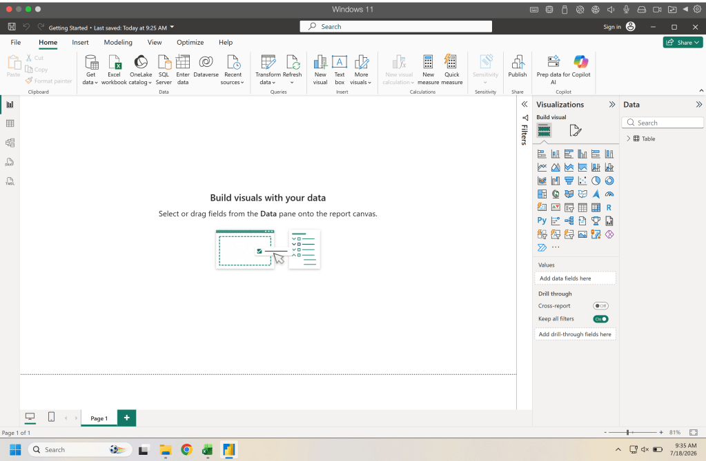
On the left hand side of the window there are a few options the second one down looks like a table and this is our table view. Since we only have one table this is the one that will show up, if you have multiple you would select the one you want to work on from the right hand data panel.
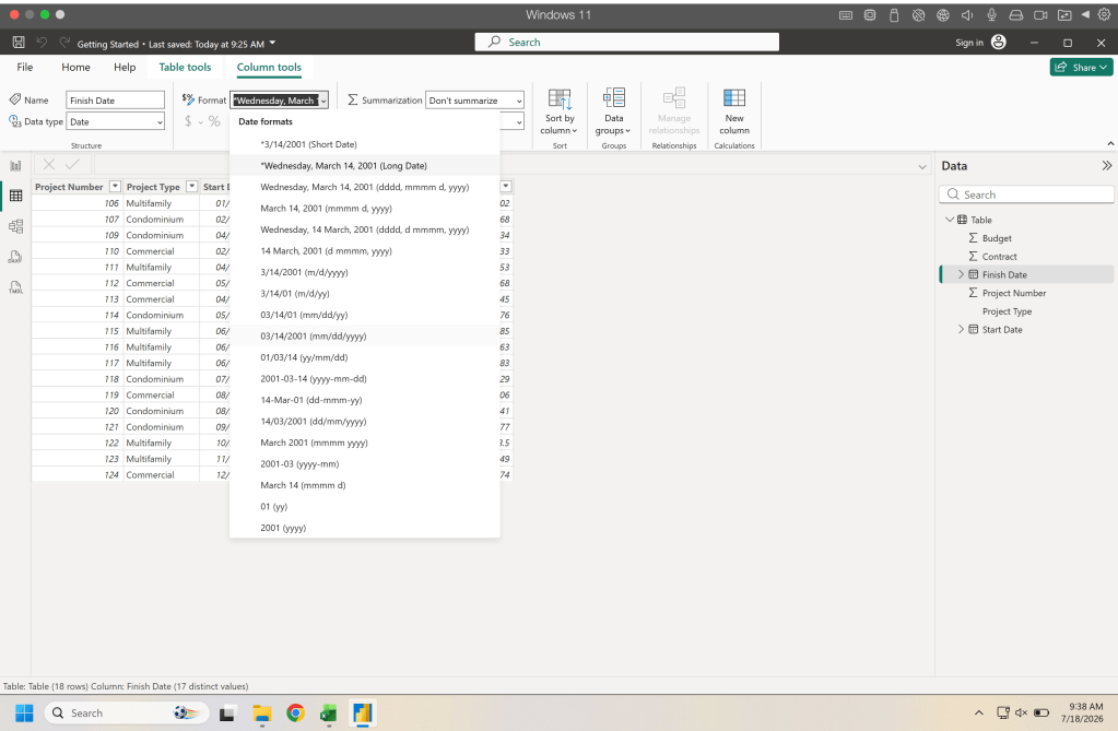
When you click on a column in the ribbon you will see some options to change the data type and data format. Lets change our dates from long form to short form and change our project number from whole number to text (the reason for this is so that we don’t confuse the project numbers as numbers that can be used in math calculations).
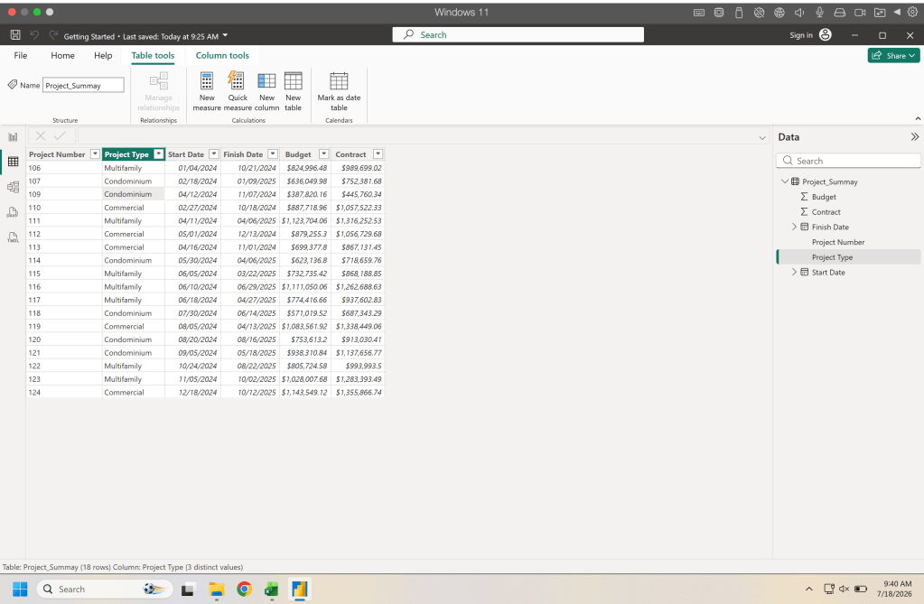
And finally up on top of the ribbon select table tools and you can rename the table we renamed it as Project_Summary here.
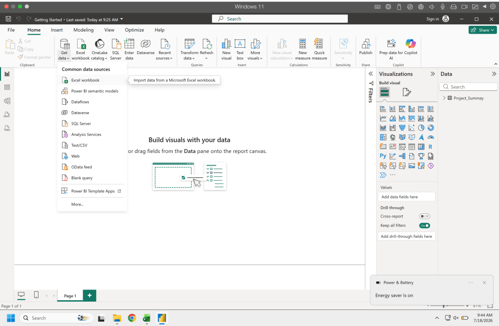
Now lets bring in some data from an external source. Back on the visuals page click get data and select Excel Workbook.
Navigate to your workbook and select it and click open and a new window will open that will show you all your sheets and tables. Select the table you want to bring in, in this example it is the project_data table. Once selected click transform to open up power query where we can clean and transform our data.
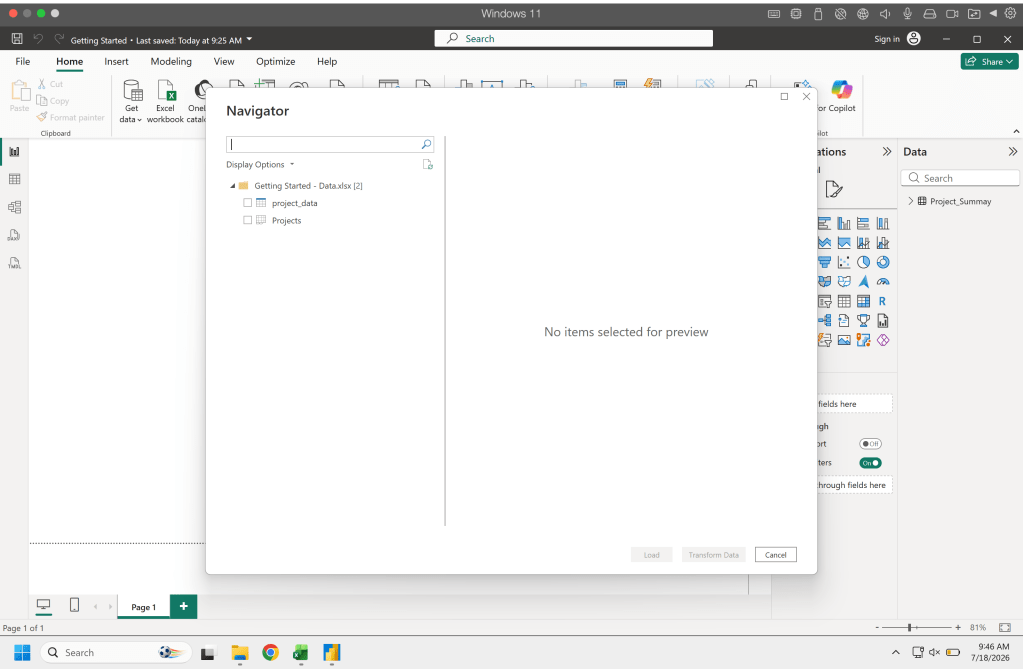
From here we want to convert our project numbers to text for this table. In the data type field you would select text and it will open a prompt that will ask if you want to replace step, add step or cancel. If you choose to add a step it will show up in the applied steps section of the right hand panel (this can be helpful if you need to track all the different steps) for this example we can replace step. Once that is done in the home tab of the ribbon you can click close & apply.
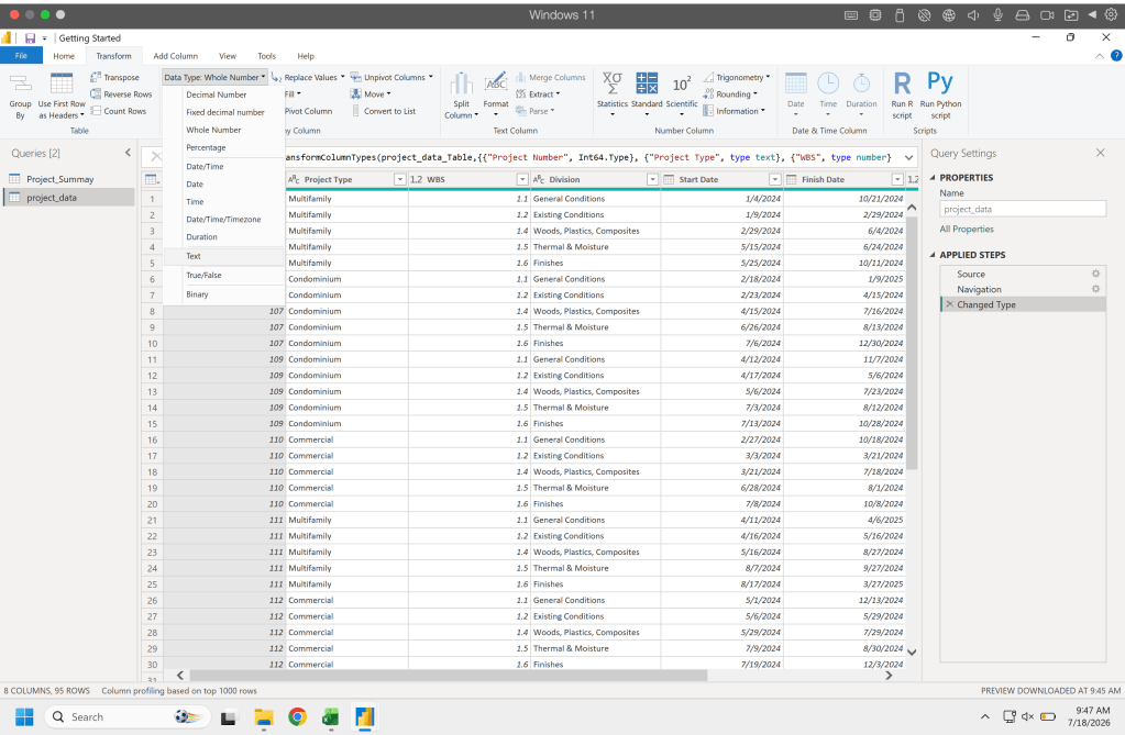
Now you will see in the data panel on the right hand side there is two datasets one is the summary we manually imported and the other is the data we just imported from another workbook. The key difference is that if we add or change data in our workbook all we need to do to import that data is hit the refresh button whereas with our manual data we would need to manually add the data.
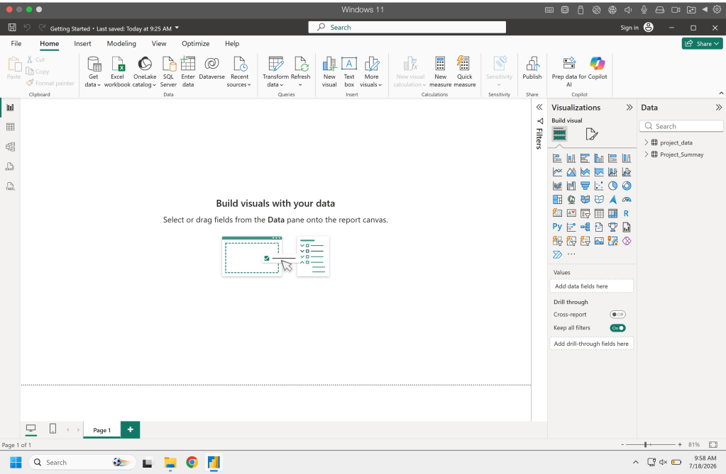
Basic Calculations
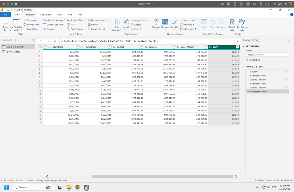
Now lets say based on the data we brought in we need a few more metrics in our data and we can calculate those based on the data we have. Lets go back to table view and i the right hand panel on our summary data right click and hit edit query. This will open up the query window and in the ribbon go to Add Column and click add custom column.
In the custom column window (see below) you can name your column and add a calculation. Here we can name this column Gross Margin and in the formula area we can select the contract column and then minus the budget column. When we click OK this will populate a new column with our calculation.
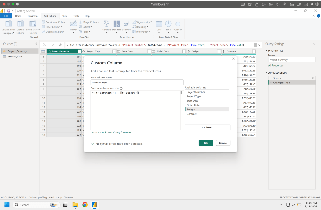
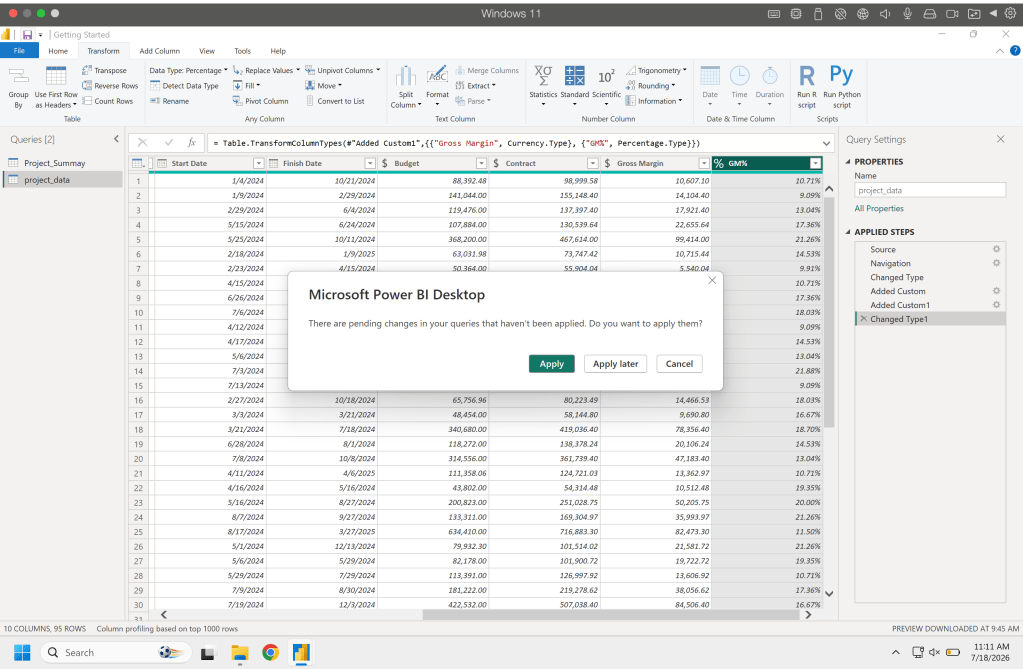
Lets go ahead and add a GM% column (Gross Margin divided by Contract) and do this for both data sets.
When you click save you will be asked if you want to apply the changes you made. You can apply at this time and exit out of the window.
Creating a Visual
From here we are going to create a few quick visuals. Based on my experience the best way to learn the visual aspect of PowerBI is to get data loaded in and then play with different visuals. Explore showing the data in different ways, sketch out what you want to see and try to create that, just play around.
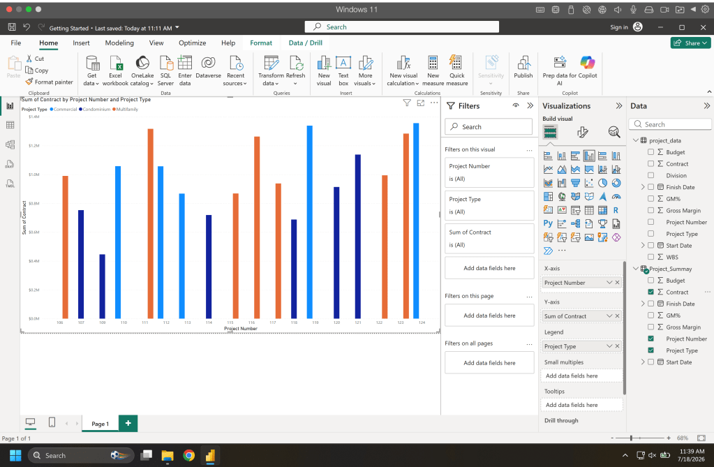
For our fist exploratory visual in the Visualization panel on the right side hover over the different icons to see what each of them are and then click clustered column this will add the visualization to the report page. From here you can adjust the size of the visual. In the visualization panel you see fields for the x-axis, y-axis, legend, etc. Now you can drag and drop data from the Data panel into those field. For this example Contract was added to the Y-Axis, Project Number to the X-Axis, and project type to the legend.
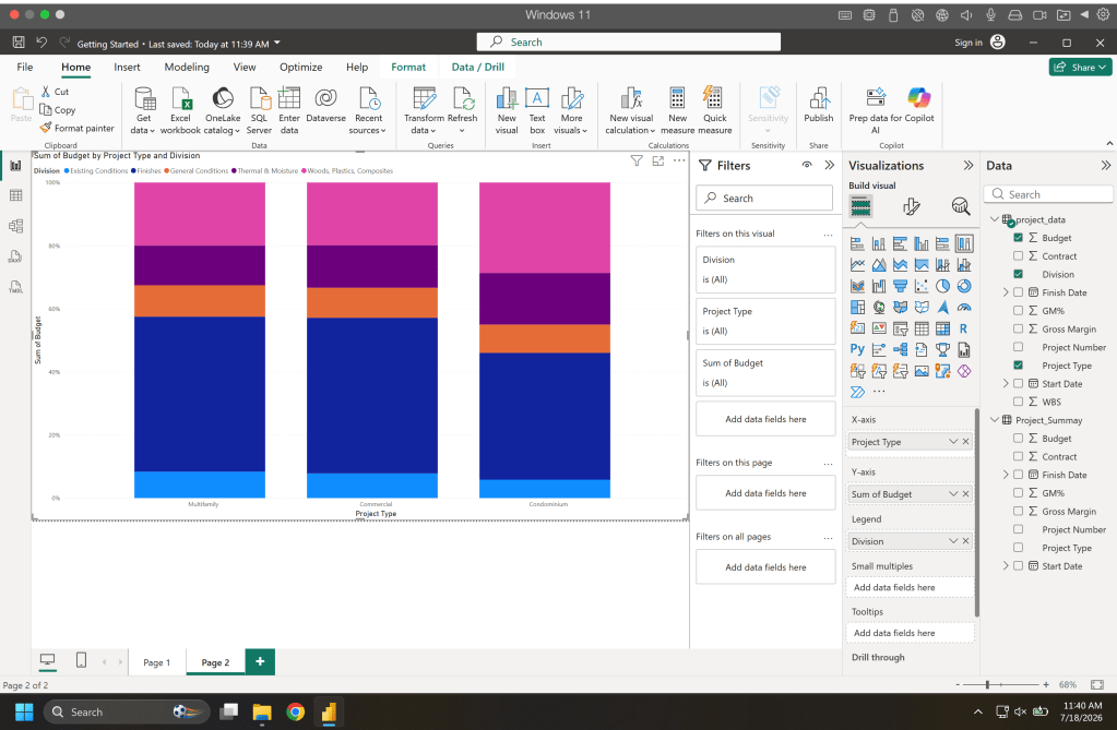
Next lets create a 100% stacked bar chart. For this we select that visual and drop into the field the following. Budget into the Y-Axis, Division into the Legend, and Project Type into the X-Axis.
And lastly lets create one more for fun. Select clustered column once again and this time add Budget and Contract to the Y-Axis, Division to the X-Axis, and Project Type to the small multiples.
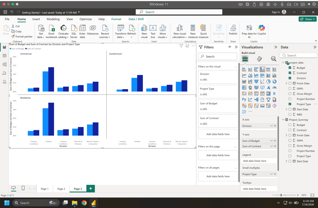
From here explore all the different types of visuals, change the data up, have fun with it. There is a plethora of information out there on PowerBI and how to create different charts, go have fun.
Resources
The code, data, and notebooks used in this articles can be found in the companion github repository by clicking the button below.

