
What is a learning curve? Think of building a piece of DIY furniture for your home office. Let say a book shelf. The box arrives, you unpack it, set all the parts out, glance at the instructions (maybe?), and get started. You work on the book shelf realize you need to keep referencing the instructions, realize you made an error and have to undo something. All these steps take time. Now imagine you have 500 bookshelves to assemble. The first one is similar to the first scenario we described but the second one you have more background knowledge and you reference the instructions less, make less mistakes, and it takes less time. By the time you are on the say the 25th you make no mistakes and probably aren’t referencing the instructions at all. By the time you are on number 50 you have found out some ways to make the process more efficient. By the time you are on the 450th one you realize your task is nearing completion and you start to slow down a bit, whats the rush, you are almost done. Now imagine you are done and you go home and take a break for a week. The next week you have 250 book shelves to do. The first one will take you less time than the first one you ever built but more time than when you were at your fastest. This is because when you take a break you begin to unlearn the task.
If we were to plot this scenario out we would see that there is a point at which we reach peak efficiency for any given task. This is influenced by many factors but for now we are going to explore taking some bulk labor data and finding the equation we can use to adjust our production based on a project size.
The Data
For exploring labor data and learning curves in this article you can find the data used at the Github Repository below. Please note that this is all synthetic data and does not related to any real world project, it is for illustration purposes only.
The Setup
In this article we are going to be using Microsoft Excel to explore our data, visualize our data, aggregate our data, and build a model to help us predict our production rate for a given quantity of material.
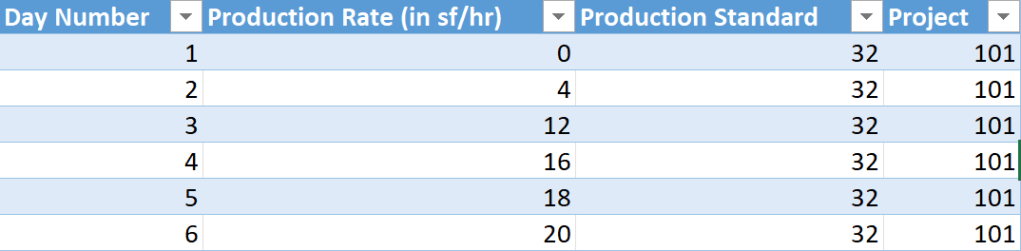
Lets assume we have a dataset that give us the amount of days on a project and the quantity of material (average per person) installed each day. Below is an example of our data, we have the day number, production rate (how much got installed each day), the production standard (how much we estimated would be installed each day), and our project number.
From here we can take this data and start to analyze it and start creating a model to help us predict future production values.
Testing Our Data
In the repository is a small dataset titled “Labor Data” this is what we are going to start with. The completed project is the other document titled “Labor Data – Learning Curve”.
Firstly we can to see a portion of our data and look to see if there is indeed some form of production curve. In excel insert a scatter plot chart.
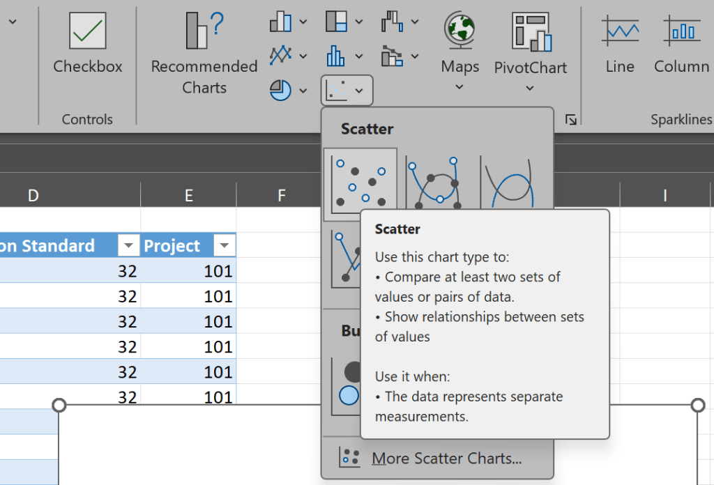
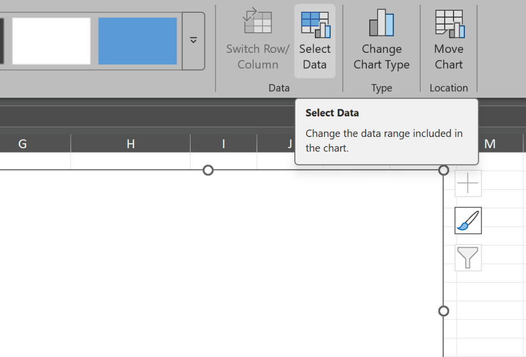
With our blank scatter plot entered we now need to populate some data into this chart, select the blank chart and click select data.
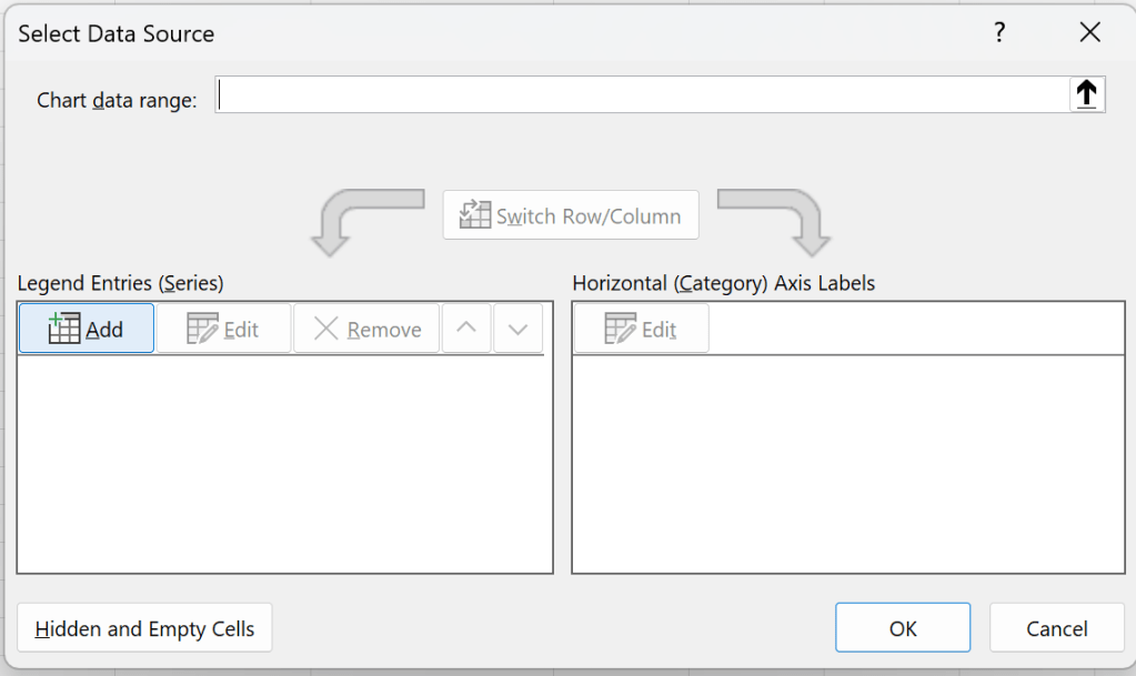
Once in the select data source box click add under legend enteries (see photo above). This will bring up the edit series dialog box where we can select our series. The series name can be anything you like but I selected the header of the Production column, the X series is all the day numbers for project 101, and the Y series is all the production values for project 101.
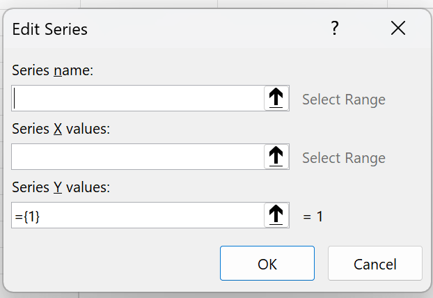
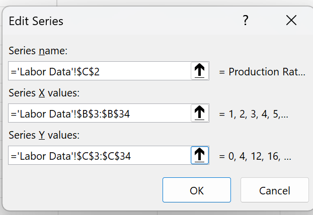
Click ok on the edit series box and then again in the select data source box and you will get a scatter plot that should look alot like this.
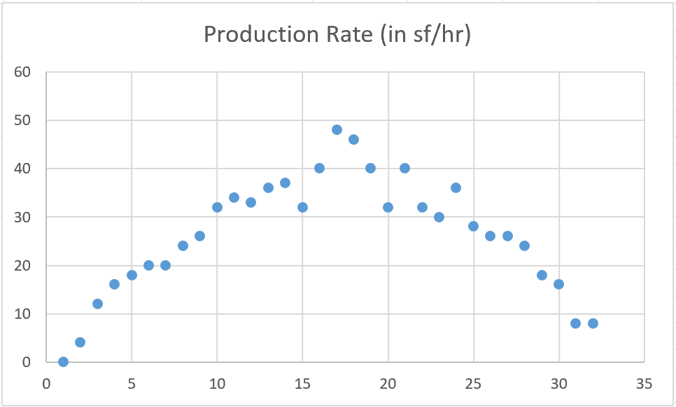
Just looking at the data we can see that there is a curve, what we want now is to see a trendline and the equations for that trendline on the curve. Click on the chart and add a chart element there is a more options arrow next to trendline and in there is a more options, select this to add your trendline.
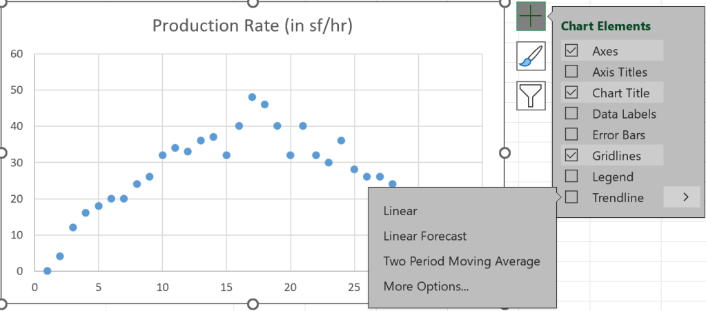
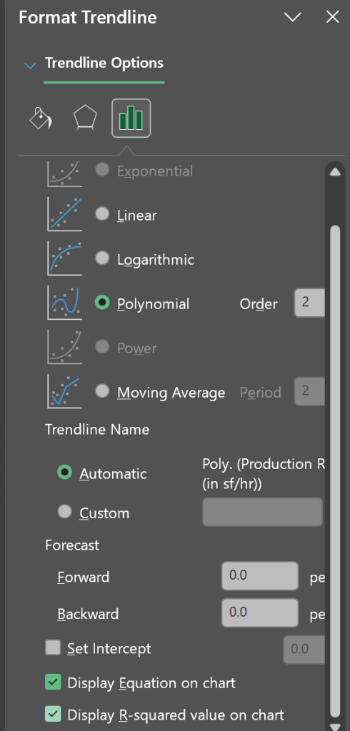
Selecting more options should bring up the trendline formatting sidebar in Excel and in here we can select that we want a Polynomial trend line and the order is 2 (we can change this later but for all of these examples we will stick with 2). When selecting the polynomial also select that you want the equation and the r-squared displayed on the chart.
This should give us a chart with our data, a trendline, an equation, and our r-squared. Now I am not going to get into r-squared here but there is a plethora of online resource that can explain the statistics, one of my favorites is https://www.statology.org/
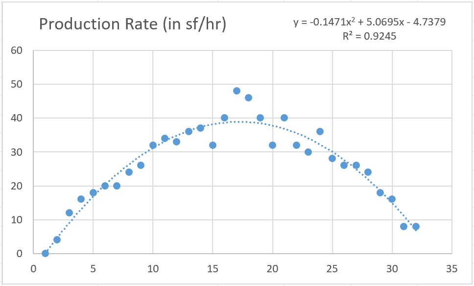
So with our completed chart we can see that we have a good curve and that a polynomial trendline fits that curve quite well. I would encourage you to check some of the other jobs and see if they are the same but for this article we are moving on.
Aggregating Our Data
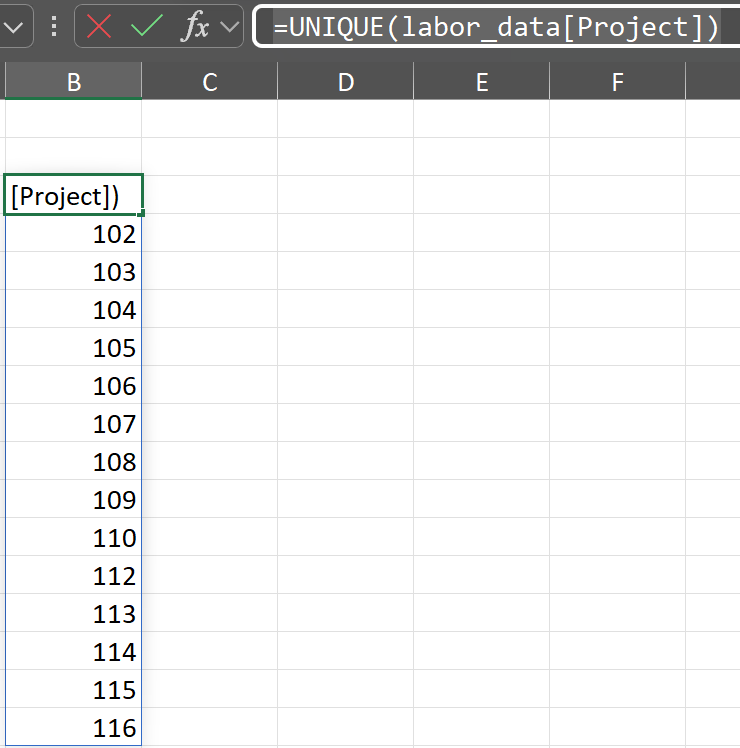
Lets create a new worksheet in our workbook and create a list of our project numbers. To do this in cell B3 will will write the following formula
=UNIQUE(labor_data[Project])
This formula will create a dynamic array with all our project numbers spilling down column B.
Starting in cell D2 create a table with the columns shown in the photo below and in cell D3 link to cell B3 to populate the project numbers. This should auto fill since it is a table. The reason you cannot directly add the UNIQUE function to the table is that it is a dynamic array function and this do not work inside tables.
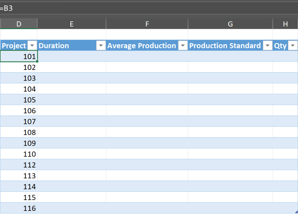
The formulas for each column of you table are as follows. You should only need to write each formula once as it should autofill the remaining cells in the table column. Add each formula to the top cell of the table column.
Duation
=MAXIFS(labor_data[Day Number], labor_data[Project], [@Project])
Average Production
=AVERAGEIF(labor_data[Project], [@Project], labor_data[Production Rate (in sf/hr)])
Production Standard
Note: this is our standard productivity we used in our estimates. For this example we are assuming the company uses a 32 sf per hour production rate when estimating this work.
=32
Quantity
This one needs a bit of explaining. Typically you would already have this number and would use it to cross validate the production rates. For our example we are going to create this metric.
=([@[Average Production]]*8)*[@Duration]
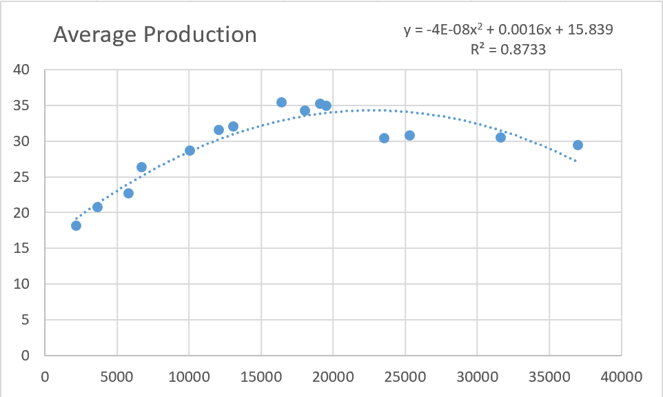
From here we create a chart just like to one we did before but this time using our aggregated data and our X values are not the Qty and our Y values are the average production.
Building a Model
Now comes the fun part. What we need is a way to input a new Quantity and have a model return a projected production rate based on our data. For this we need to extract that equation from our chart but simply copying the equation wont work as we would need to redo the equation each time new data is added as the equation will change. Instead we are going to get these coefficients directly from our table. Lets create a new worksheet in our workbook and copy and paste our chart over there.
Once that is done lets add a formula to the page (I adjusted my chart size so I am going to add this formula to cell A20). Side note I renamed my aggregate table to “agg” so that is what will be referenced in the formula below.
=LINEST(agg[Average Production],agg[Qty]^{1,2})
Make sure to hit CTRL+ENTER when finishing this formula as it is an array formula
This will give your the three coefficients from your dataset those same one from the chart equations and these since they’re based on your table will update each time you add data to the table.
Somehwere on you sheet add a descriptor for the Quantity and Projected Production. Next to Qty is where you will enter the quantity you are trying to project production. The cell next to Projected Production is where we will calculate based on our data.
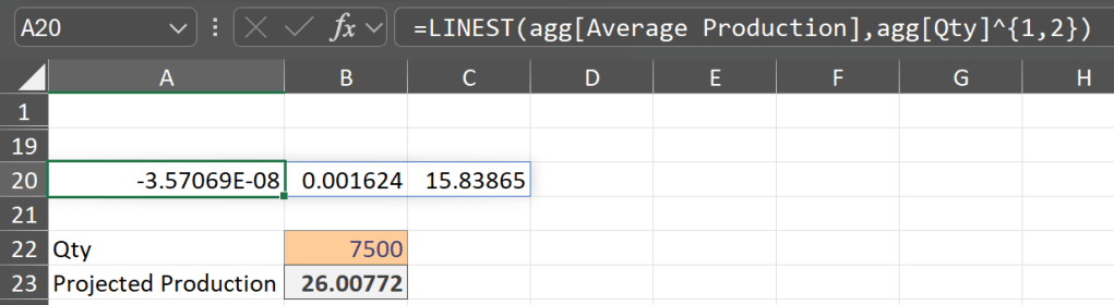
In the cell next to Projected Production enter the following formula. Reference the image above and the equation in the chart for which coefficient goes where. The basic formula is .
=(A20*(B22^2))+(B20*B22)+C20
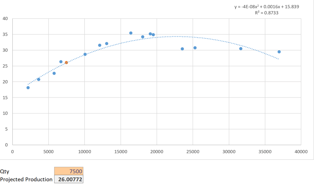
Now we need to add these two data point to our chart. Select the chart and select data and add a new series, name is the Projected Production cell, and add Qty to the X, and the Projected Production to the Y. Sometime excel will then show me a blank chart. If this happens open back up the select data box and click on the Projected Data series and click OK and it should come back with a new data point on the trendline.
Thats All Folks
Now we have a model that uses our data to inform us on the projected production based on the amount of material we are installing. You do not have to used Qty as your predictor though explore using project type, building height, region, etc. to see what impacts your production curve the most.

