
Hello Excel my Old Friend
Ah yes, were would the world be without excel, the most ubitquitous business software ever1. You most likely are familiar with excel, came across it in the wild, used it to create many a budget, estimate, schedule even. There are most certainly reports in excel that you read or generate. You may use it as a form of some sort, treat it as a nice organize grid for some form of data, the uses are endless it would seem. You may however, not being using some of the other features that make excel quite nice for some data science projects. Lets Explore!
Power Query
The first feature we are going to explore is power query, this is excel’s built in data cleaning and gathering service (theres probably a more techy way to describe that but I’ll leave that for the tech experts). First we need to get some data, for this example we are going to use a table from within our workbook. You can also bring in data from other sources such as other workbooks, databases, online sources, etc.
Click somewhere inside your table and go to DATA -> Get Data -> From Other Sources -> From Table/Range.
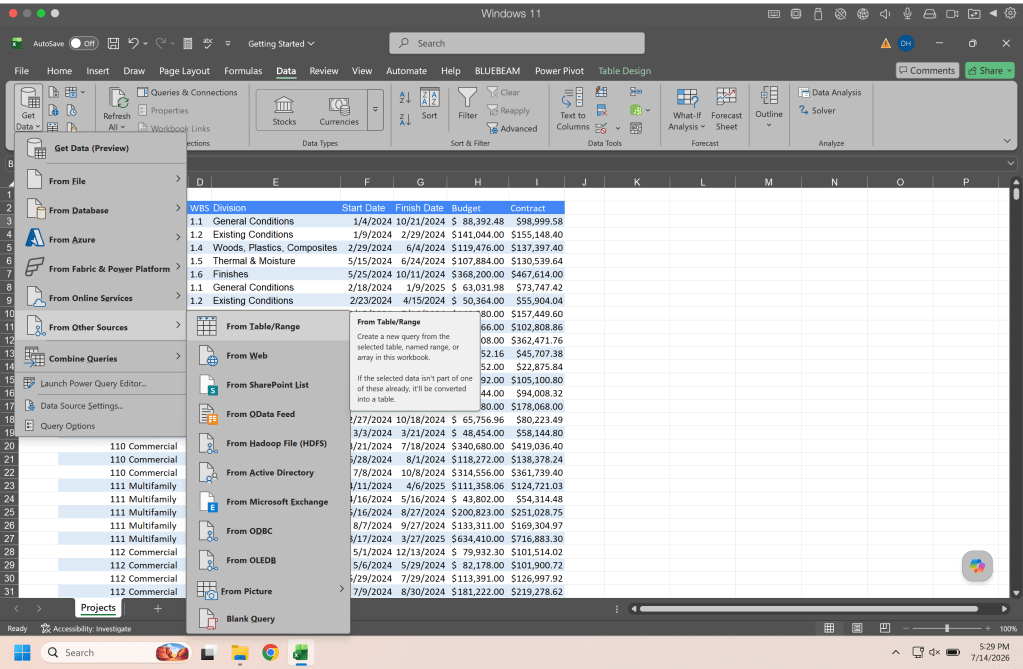
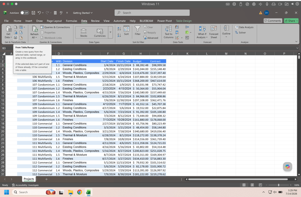
Alternatively there is a button on the Data ribbon for importing data from a table/range.
Once you select From Table/Range the data will be pulled into Power Query and a new window will open up and it’ll look something like this.
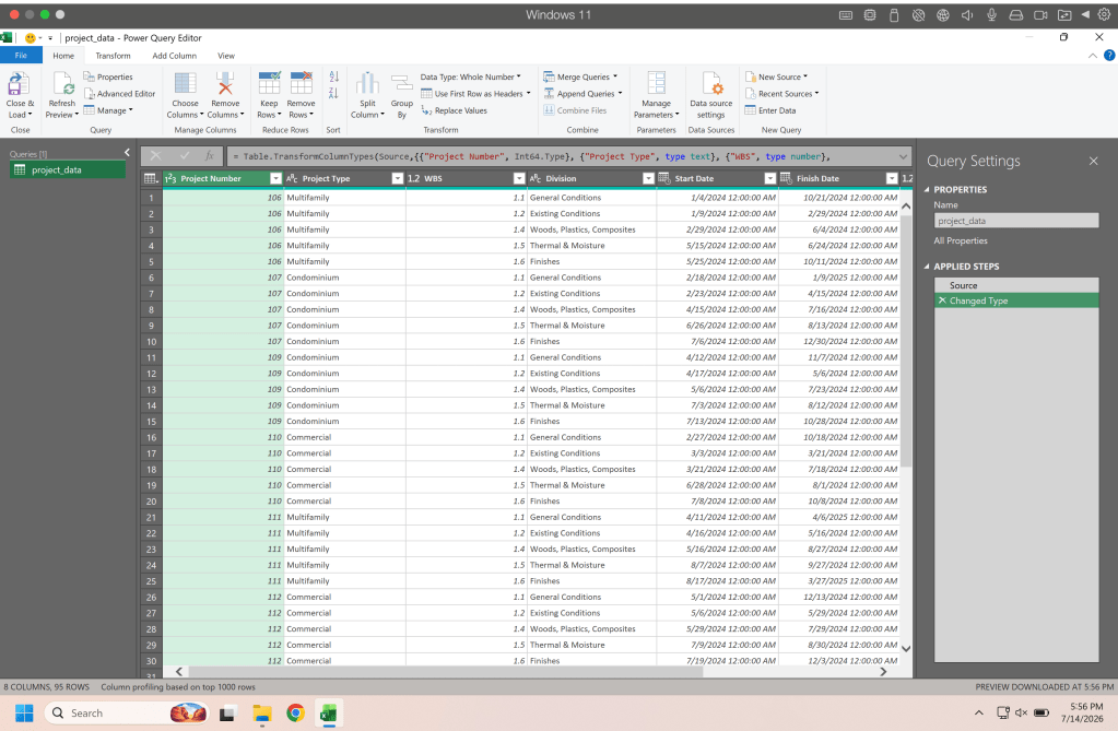
This is Power Query, from here we are going to set up our data. We can see our data columns are in Date/Time format but we don’t need the time we only want the date. We select the header of the column and click the drop down on the data type and select date.
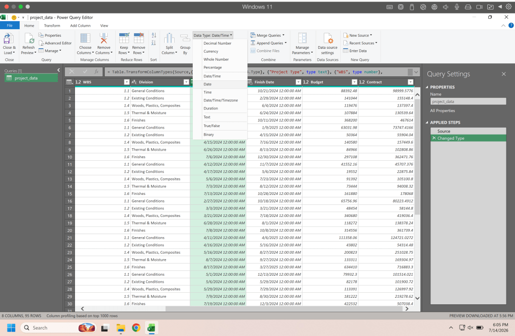
Once we click date in the data type drop down we will be asked if we want to replace current, add new step, or cancel. For this example click replace current. This will change the data type for that column, add new step will add a step so the next time data is imported it will perform this step and change the data type, this is helpful is you are repeatedly performing data importing from a source that needs this change.
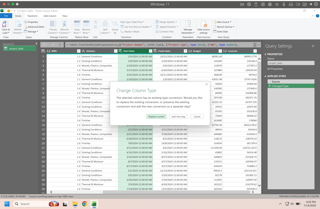
We repeat this step with the other data column and move to the budget and contract columns where we will change the data type to currency.
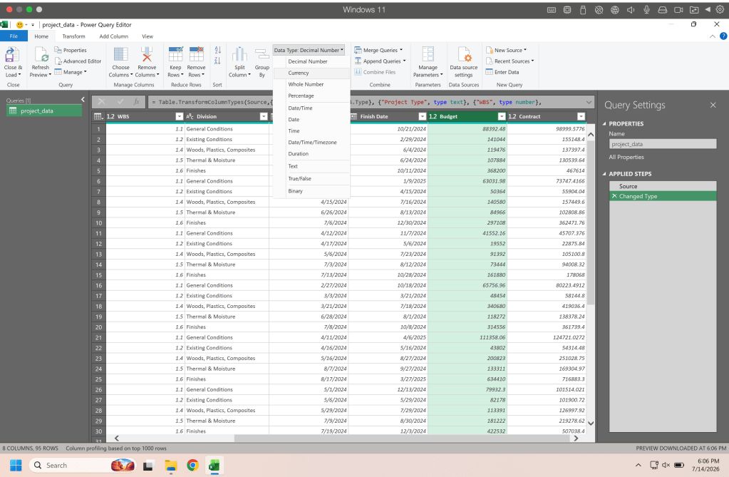
From there you can change the data type on the WBS to text so that it is not confused for a number. In the formula bar you’ll see all the columns and the transformations made to those.
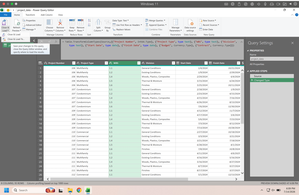
= Table.TransformColumnTypes(Source,{{"Project Number", Int64.Type}, {"Project Type", type text}, {"WBS", type text}, {"Division", type text}, {"Start Date", type date}, {"Finish Date", type date}, {"Budget", Currency.Type}, {"Contract", Currency.Type}})
Once our data is transformed we can click the drop down next to close and load and select close and load to.
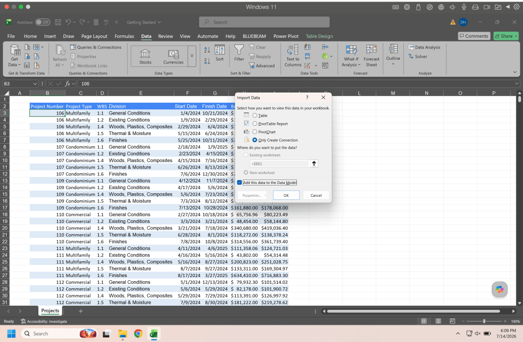
This will return us to the normal excel view and open a dialog box where we choose our load settings. Here since we already have the table in excel we want to Only Create Connection and we want to Add this data to the Data Model and click OK.
Once that is done you will see the Queries & Connections panel showing your table. If you close this panel and need to get back to it go to the Data tab and select Queries & Connections. If you were bringing in data from another sheet and wanted to see the table in your excel workbook you would select table in the import data dialog box and then select where you want it.

Ok well our data is now in our data model so we can move on to the next feature. I highly recommend taking the example data provided in the repository at the end of this article and exploring bringing it into a blank spreadsheet and changing the data in the example sheet and refreshing it to see how it changes on the other sheet.
Power Pivot
Power pivot is where our data model live and hangs out, on Tuesdays it orders pizza and watches old movies. Here you can modify your data, add new columns, create relationships, etc, In the Power Pivot tab click manage and excel will open a new window with Power Pivot.
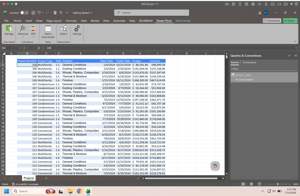
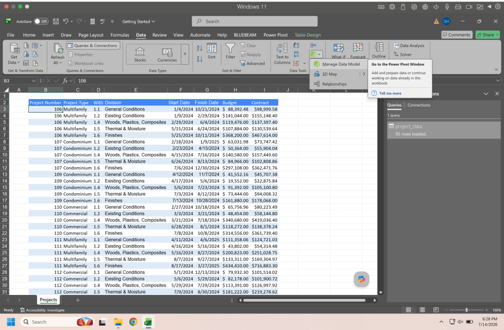
If you don’t have a Power Pivot tab or want another way to get there from the Data tab click the Power Pivot icon and select Manage Data Model.
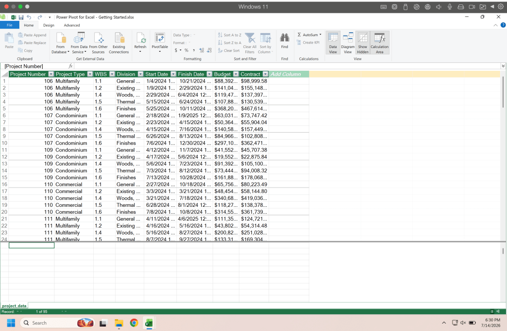
And this is what the Power Pivot window looks like. It has a couple distinct areas, the upper area is similar to the standard excel ribbon, the center mass you’ll see your data in a table form, and below our data is the calculation area.
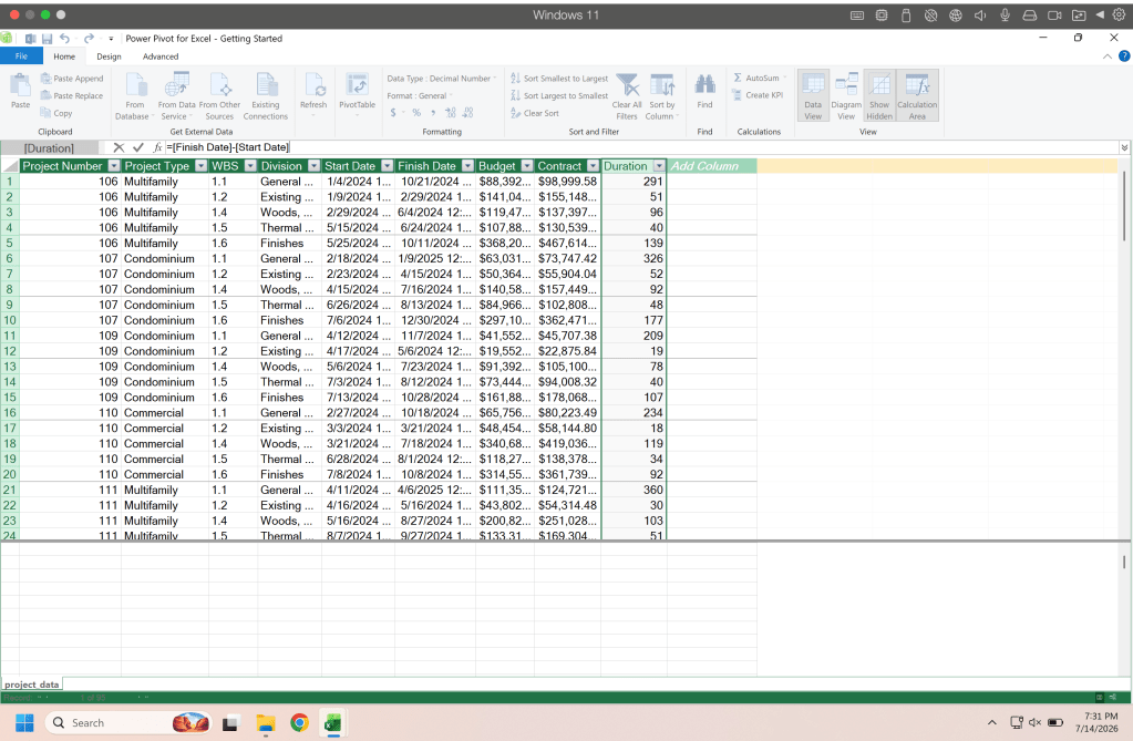
So lets add a column to our data directly in power pivot. Double click on the add new column header and give your column a name and hit enter (return on mac).
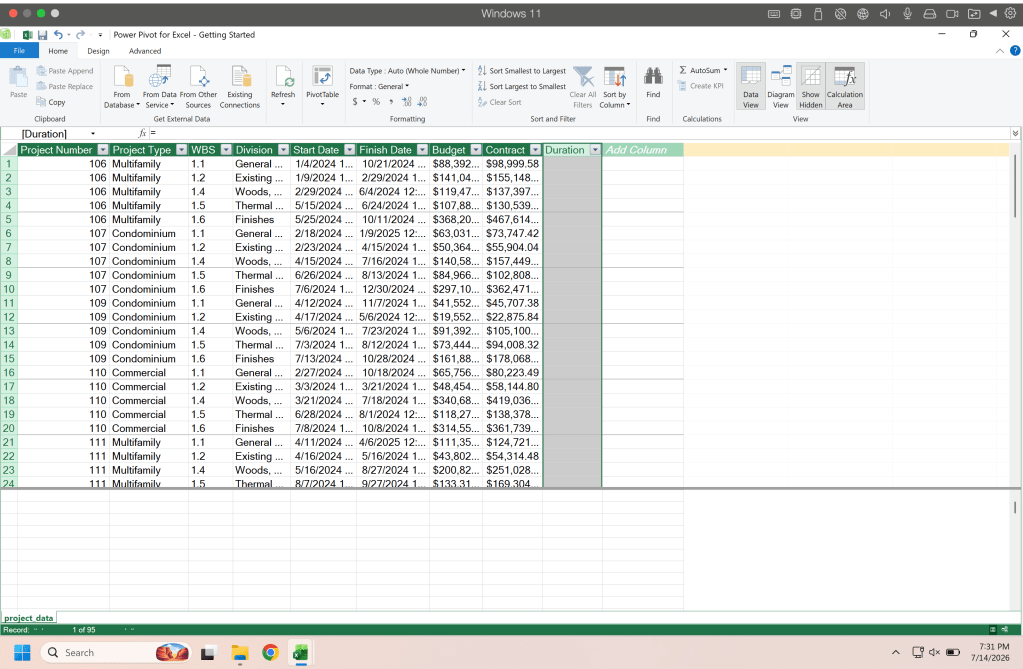
Now you will see in the formula bar the “=” and the column is ready for a formula to get the data with. Here we are going to find the duration so we simply take the finish date and minus the start date. This formula will auto define as a date column so we need to change the data type to number.
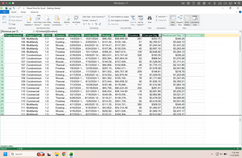
Lets say we also want our cost per day. We would add a new column and use the formula budget divided by duration.
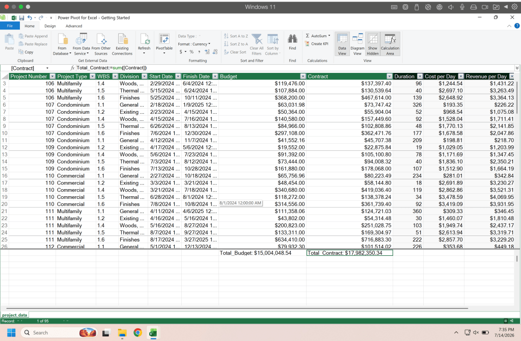
Lastly lets add some Measures, measures are formulas that are run in the calculation area. If we select the cell below the budget column we can enter Total_Budget:=SUM([Budget]) and it will return the total amount of that column and that is now a measure we can reference in future formulas.
And thats it for a introduction to Power Pivot. Now lets tap into the data model and create a brief chart using Pivot Chart.
Pivot Chart
Pivot chart is very much like it sounds it uses the same principles of pivot tables but makes charts with the data instead, which is way cooler cause pivot tables are boring and charts are not2. From the Insert tab select Pivot Chart.
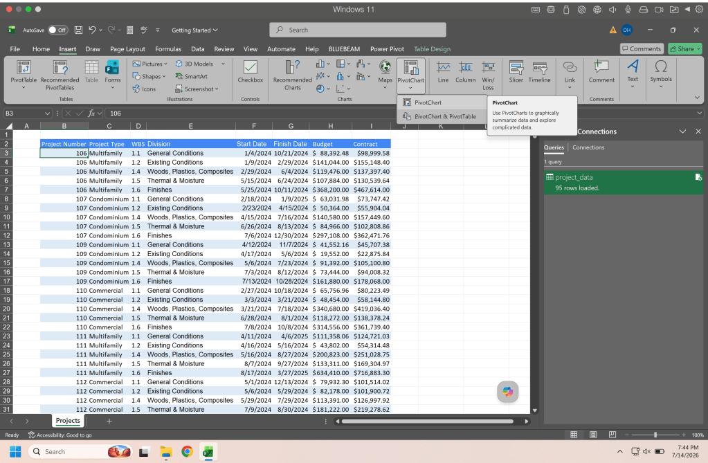
When the dialog box appears you can select Use this workbook’s Data Model. This will pull the data from the model we made earlier.
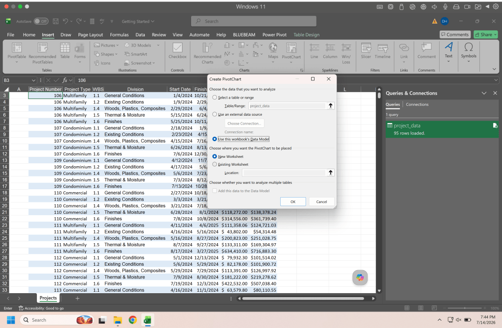
Now we have a new sheet and the pivot table fields. Notice you have project data in there twice, one (the one with the little orange cylinder) is from the model and the other is the one in your workbook.
Grab the project type and drop that into the legeng (series) box, then grab the budget and drop that into the values box and boom you got a chart that summarizes your data in a chart. I would change the colors but this is how mine came out stock.
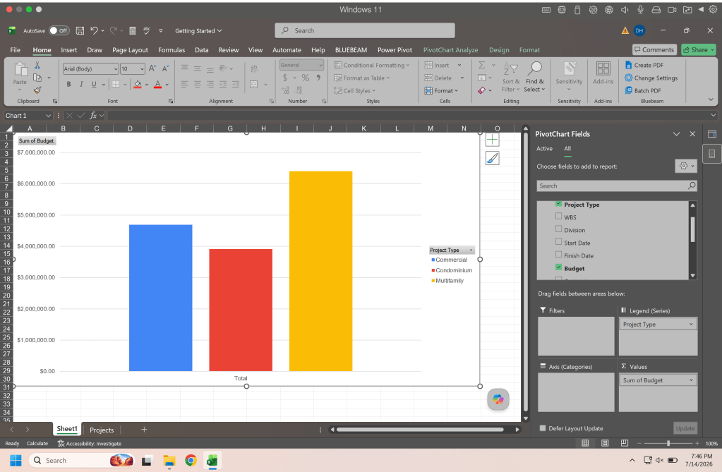
And there you have it, three data tools in MS Excel that can help you on your data science journey.
Resources
The code and notebooks used in this articles can be found in the companion github repository by clicking the button below.

